COLOUR
A MANUAL OF ITS THEORY AND PRACTICE
By H. BARRETT CARPENTER
Late Headmaster of the School of Art, Rochdale
THE STUDY OF COLOUR
ALTHOUGH Colour has for ages possessed a great attraction for mankind, and although the love of Colour is still most marked among children, it is remarkable that so little should have been done to encourage the study of it. The student, indeed, finds his path beset with difficulties. By one school he is told to study Nature, by another to follow Tradition, while a third warns him to trust to his own instinct. Now, although there is a certain foundation of truth for each type of advice, it is still true that a student may be greatly helped by being set upon a path which bears the marks of both pNature and Tradition, yet in which no man can travel far unless he will also trust himself.
A master of Colour, like a master of words, is born, not made, yet who would argue that a child should not be taught to speak ? Even so, it seems absurd not to teach a student the A B C of Colour, if we can but find what we should teach.
The great difficulty is the first step. We take our colour-box and find in it a series of tints, all of which obviously bear some relation to one another, but the endeavour to discover that relation is commonly doomed to failure. Experiment with the colour-box will, by patience and method, teach us what a vast range of tints we can make by mixing our ” paints/’ but we must remember that, after all, ” paint ” is not ” colour,” and that while the mixing of paints means loss of light, the mingling of colours means a gain of light. Moreover, experience teaches that knowledge of the colour-box is not sufficient by itself as a basis whereon to found a theory of colour.
We can easily demonstrate that the mixture of blue and yellow produces green, or that purple results from mixing crimson and blue,but although we can show how green and purple tints can be made, we do not show what relation green and purple bear to one another.
One of the first and also one of the greatest difficulties which the student meets is that two tints which are quite pleasant when placed side by side in one order of strength become most unpleasant when that order of strength is reversed. Thus a full tint of red side by side with a deep purple will appear rich and good, but if the same red be placed by a light purple the result will be harsh and unpleasing. Many other pairs of tints may be tested together and found to yield the same result, so that at once it becomes evident that this question of relative strength must be seriously considered in ill cases of harmonious arrangement. Experience proves that without a knowledge of the effect of relative strength no satisfactory theory of colour can be put forward. This reason alone is enough to show the weakness of the old yellow, red, and blue theory, which takes no account of relative strengths.
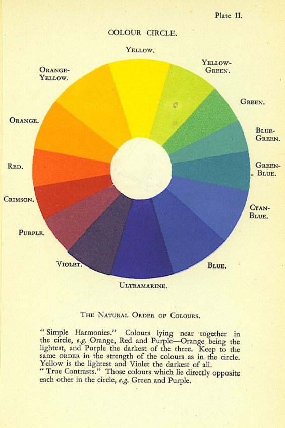
THE NATURAL ORDER OF COLOURS
IT is to Rood’s careful investigation that we owe the discovery of a sound basis on which to found a workable theory of colour. Deduced from the order of colours in the spectrum, Rood’s table of the natural order of colours is not a mere haphazard guess at the truth, for it stands the test of experiment. Briefly, this table indicates that yellow is the lightest of colours and violet the darkest, that one may travel between these extremes by two roads, i.e., by way of red, or by way of blue, and that the natural order is for orange to be deeper than yellow, red deeper than orange, and so on down to violet, while, similarly, green is deeper than yellow, blue deeper than green, and violet deeper than blue.
Rood’s Table of the Natural Order of Colours.
Yellow (nearest to white light). Orange.
Red.
Crimson.
Purple. Green.
Green-blue.
Blue.
Ultramarine-blue,
Violet (nearest to black).
The student is recommended not to take this table on trust, but to test it thoroughly for himself. The test is to take the colours in pairs, e.g.., yellow and orange, orange and red, red and crimson, and so on, working down both sides of the table. The pairs should be taken first in their natural order, i.e., yellow lighter than orange, and orange lighter than red; afterwards the order should be reversed, with orange lighter than yellow, and red lighter than orange. In both cases the test should be carried out on a fairly large scale ; indeed, the test must be tried with a good area of each tint if the effect is to be judged fairly. If, when the order is reversed, one of the two tints is arranged as a small spot or line against a mass of the other tint, an entirely new problem is presented, and this is fully dealt with under the heading of “Discord”

The result will show that, in the natural order, the colours look rich and tend to enhance each other’s value; in reverse order, the one tint appears thin and poor, while the other looks dirty. The effect of reversing the order is yet more marked when one arranges such pairs as pale violet and dark orange, deep red and pale blue, dark yellow-green and light purple.
One can hardly overestimate the value of this natural order. One has only to turn over the piles of badly-coloured patterns in many of our shops in order to realize that a natural law cannot be ignored or defied with impunity.
The great objection offered to such a law is that it must kill, or at least cramp, originality. Yet the engineer and the painter both know that in the use of their materials they must observe certain limitations, and in so doing they find their opportunity of being original. Now, if this order of colours be indeed a natural order, we ought to find it in natural colour-schemes? in the ordinary landscape, for example, in flowers and fruit, in birds and butterflies. It must be at once admitted that the natural order is not always easy to trace, but this admission must also be qualified, for it is equally true that the more searching our investigation, the more certainly will the natural order be found.
There are two main reasons for the difficulties which we are likely to encounter : first, that the natural order is, after all, only one of a group of natural laws which act together, and second, that many natural schemes are very complex. A landscape frequently presents the latter difficulty, as there will be subsidiary schemes for earth and sky, besides minor schemes for various passages of cloud and for various sections of earth. In the sky alone one may see several minor schemes at the same moment, owing to the presence of several groups of clouds at different altitudes. The colour of the high cirrus is so delicate that it is very difficult to trace, but, when traceable, the gradations follow the natural order. The alto-clouds often show colours of singular purity, ranging from cream to rose and so to purple; but, though so pure and delicate, the gradation evidently proceeds in order, the colours deepening from yellow to purple. The lower stratus and cumulus clouds commonly give the deeper notes of warm reds and purples. Sunset is probably the best time for following the order of colours ; then may be seen yellow turning to orange, orange to red, red to crimson, and crimson to purple, the first of each pair being the lighter. In the same way the open sky will change from yellow to green and from green to blue, the yellow being the lightest and the blue the darkest.
After examining the more obvious colours of the sky, investigation should proceed through the varieties of ” grey ” clouds, when it will be found that though the tints are harder to assign to their places because their foundation colours are so broken, yet it will be possible to distinguish yellow-greys, red, rose, purple, or violet-greys, as well as those based upon tints of green or blue, and these greys will be found to follow the order.
In the case of trees the young foliage is light and yellowish, the change to green being accompanied by a deepening of the colour. When turning yellow in autumn the foliage becomes lighter. Many kinds of leaves show variations from yellow to red and from crimson to purple, and the yellow is usually lighter than red, the crimson lighter than the purple.
The transition from the colour of a flower to that of its stalk is marked by a close adherence to the same order. Thus a red flower commonly becomes lighter and yellower towards its calix, while the yellow deepens and changes into green upon the stalk. In the blossoms themselves when yellow and red, red and purple, rose and blue, or yellow and blue come together, they follow the rule. In roses, carnations, and nasturtiums, for instance, when red and yellow come together the red will be the darker, while crimson will be darker than red. In fuchsias, petunias, and clematis, purple is darker than crimson.
The colours of most fruits follow the same order. Fine examples may be seen in the berries of either of the bryonies or of the winter cherry; green becomes lighter and yellower, yellow grows darker to orange, and orange to red. In the case of damsons and the darker plums the red tints deepen into purple, but the ” bloom ” which inclines to blue is lighter than the deep purple of the skin.
Oranges and lemons, green at first, become lighter as they become yellower; melons, pumpkins, and vegetable marrows do the same.
Among the more brilliantly coloured birds the natural order is often more difficult to follow, because the colours are so often broken up into very small portions; but the principle can be traced in many instances when the main colours occupy a considerable area, proportionately to the whole surface of the bird.
The following examples are particularly clear, and the order of the colours can be easily traced :
Yellow and red in the ruby and topaz humming-bird ; green-gold, deep red-purple, and deepest violet in the emerald-throated humming-bird ; crimson and purple-red in the velvet tanager ; pale green, purple, and deep ultramarine in the long-tailed roller ; orange, dull green, and dark greyish ultramarine in the blue-tailed roller ; yellow and olive-green in the great tit; yellow, greenish blue (turquoise) and violet-blue in the black and blue titmouse ; yellow-green and full blue in the blue and black creeper ; green, blue-green, green-blue, blue, and ultramarine in the bee-eater ; green and blue-green in the black-headed grigri; greenish blue and purple-blue in the blue creeper. The foregoing examples include the whole range of colours from yellow to violet through red and through green.
The student will doubtless find numerous instances of small patches of colour in which the natural order is reversed, but it must be noted that these patches are always small, and never occupy the greater part of the surface. The reason for their use will be dealt with later under the head of ” Discord.”
Not many of the shell families show ranges of full colour; more often the tints are broken or the colours are split up into a fine mosaic, but the brilliant pectinidx make up for any deficiencies in this respect. They show a gorgeous range of tints, turning from yellow to orange and from red to purple, always in the true order. The spondylidae, or thorny oysters, show similar ranges of colour in very lovely gradations.
After considering the evidence in Nature of a regular order of colours, one may well ask whether there is any evidence of a preference for such an order in the colour-schemes used in those countries in which the feeling for beautiful colour is peculiarly strong. An examination of Persian, Indian, Chinese, and Japanese colour-schemes shows that the natural order is observed to a quite remarkable degree, and that the deviations from it are usually easy to explain. Investigation of the best European colour-schemes yields the same result, so that natural law and natural taste appear to coincide to a wonderful degree.
Were there no hindrances to the development of natural taste we should probably use beautiful colour instinctively, but under the conditions of modern life anything like natural development is so difficult that special study must be given to every subject in order to find a true starting-point. A nation devoted to trade and manufactures, as a means of gain, must cultivate the idea of colour, and study it thoroughly, or the very sense of colour will die.
The possession of a well-defined basis for the systematic study of colour is of very great importance to all those trades and manufactures in which more than one colour is employed in one piece of material or upon one surface.
The natural order of colours supplies such a basis, and the principles which can be deduced from it provide opportunity for an endless series of well-ordered experiments on well-defined lines.
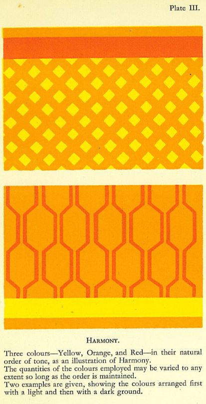
Three great principles which can be deduced from the natural order are Harmony, Contrast, and Discord. All three terms are in common use, though their meanings vary greatly. The meanings given to them, in this book are set out in the following chapters.
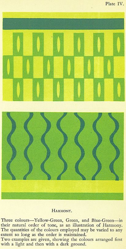
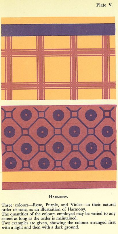
Simple harmony is the effect produced by using any colour together with its next neighbour, or neighbours, in their natural order. For instance, orange-yellow supported by yellow and orange, the yellow being lighter and the orange darker, will give a simple harmony; similarly one might choose red, supported by orange-red and crimson-red, or purple, supported by red-purple and violet. It is, of course, unnecessary to use more than two colours to obtain the simplest form of harmony.
Used in pairs, or in threes, in the natural order, no colours will appear unpleasant. As a test, some simple pattern should be chosen and coloured with any pair in its proper order. The same pattern should then be tried with other pairs taken from different parts of the colour circle.
Such arrangements tend to give an effect of richness without disturbing the chief note of colour. It may perhaps be thought that these simple harmonies are too simple, but it must never be forgotten that a great many ordinary woven and printed fabrics are not intended to provide more than one note of colour in a scheme. Provided that the surface be enriched sufficiently to make it interesting, there is no need to treat every pattern as though it must needs contain a complete colour-scheme. Many otherwise satisfactory arrangements are spoiled by the introduction of quite unnecessary contrasts.
Such harmonies abound in Nature, but their very frequency tends to prevent our noticing them. A clear blue sky is perhaps the best example because of its large area. The wonderful quality and richness of the blue does not depend solely on gradation from dark to light, but on variation in the quality of blue, greenish blue, full blue, and even ultramarine following
one another in order. Foliage in large masses often gives well-defined harmonies in yellow-green, green, and blue-green. Dry grass supplies harmonies in yellow, orange, and orange-red. These instances are given because of the large areas involved, but on a smaller scale the number may be greatly increased. Simple harmonies in Nature are composed not only of great areas of clear, brilliant colour, but of small spots of clear colour supported by larger spaces of colour closely related but somewhat broken.
Following up this line of study, we find that a simple harmony can be varied by confining the original colour to spots or figures while the remaining surface is composed of shades of the same colour more or less broken, e.g., yellow, as the keynote, supported by brownish yellow and yellow-brown, or blue, supported by greyish blue and blue-grey. In such cases the extent to which the breaking of the original colour is carried will materially affect the value of the arrangement if required to form part of a large scheme.
Thus, if blue be used sparingly and supported by large quantities of grey in which blue preponderates but slightly, the whole effect will be sober, not suited to a prominent place in a very brilliant colour-scheme, but admirably adapted to act as a background to brighter tints.
The breaking of a colour is here understood to mean the mixing with it of other colours, harmonious or contrasting, or even both. Thus red may be mixed with yellow to turn it toward orange, after which a further mixture with a little blue will take off the edge of the colour and dull it materially, while, at the same time, making it much more easy to deal with. A colour broken in this way has affinities for a much wider range of tints than a clear, pure colour, but what it gains in adaptability it loses in brilliance.
The weaver can employ this device with far less sacrifice of brilliance than the painter, for the interweaving of colours produces a fine shimmer where a mixture of paint would produce dullness. Thus a weaver may have stripes of red warp set amid black ; and working with a red weft he will produce a brilliant colour where red warp and red weft meet, supported by a very reduced and broken tint of red where the black warp mingles with the red weft. The student is recommended to make a full and careful study of simple harmonies:
- (1) By arranging as many pairs of pure bright tints as possible, but, of course, keeping strictly to the natural order ;
- (2) By arranging further sets of pairs of the same colours, making one set pale and the other deep ; and
- (3) By. making a series of brilliant tints supported by broken tints in which the original colour predominates, but which are reduced in brilliance.
Such study as this may well form the foundation of a colour course for painters and decorators, weavers, and all who have to deal with colour in the textile trades, for window dressers, salesmen, buyers, and others engaged in the furnishing trades, as well as for dressmakers and those who deal with dress materials.
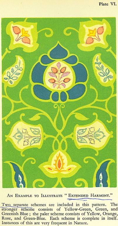
Extended harmonies are here taken to mean schemes in which the original pair or trio of harmonious colours are supported by lighter and darker sets of the same colours. Such an arrangement allows the use of a wider range of tone than would otherwise be possible, and consequently permits of a more varied effect.
Such extended harmonies may often be studied in the sky, particularly when clouds are present at different altitudes. The upper clouds show the most delicate tints and the lower clouds take on the deeper shades, but the interweaving of the different passages suggests wonderful possibilities in following up this line of study. It offers a means of obtaining unity without monotony?always a very difficult problem, but one worthy of the earnest attention of those who have to deal with schemes of decoration.
CONTRAST
Contrasting colours are here understood to mean those which, when placed side by side, intensify each other but do not change. Colours which are not contrasts do tend to change their appearance when placed side by side. Thus red placed side by side with yellow appears more rosy, while the yellow looks more inclined towards green than when seen alone. But if red be placed by purple, the former will appear more orange and the latter more violet.
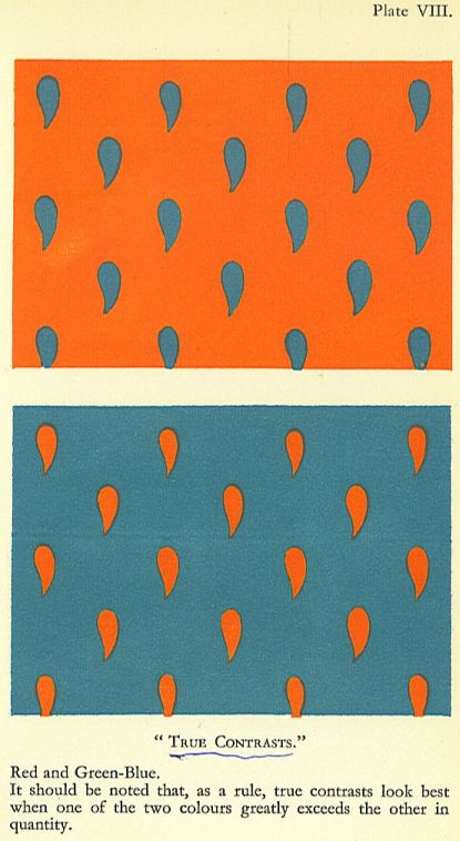
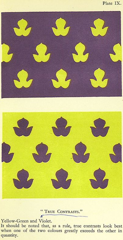
It is to Rood again that we owe the table of true contrasts. By measuring the proportion of each colour in the spectrum, and by dividing a circle in the same proportion, Rood produced his colour circle. He claimed that by taking the tints in pairs, as they stood opposite one another round the circle, a series of true contrasts would be produced. Careful trial will show how right he was. When his table is compared with the old three-colour table, with its complementaries, one might fancy at first glance that the difference was not so very great, but the difference is just enough to ruin a great many colour-schemes. Orange-yellow is not so far removed from orange, but it does just supply the perfect contrast to a central blue which full orange just misses. The most notable difference is probably that which occurs in the case of red and green-blue instead of red and green. A full red and a full green (neither of them inclining to either side) are distinctly not satisfactory as a contrast, but a full red against green-blue (a colour just on the borderland between green and blue, though inclining to the latter) glows with a wonderful intensity and a marvellous beauty.
Although but a few of the most familiar and pronounced tints are marked and named in the colour-circle, it is easy to determine the place of intermediate tints.
In working out a circle it is necessary that the tints used should be, as far as possible, of the same relative brilliance. If a colour be mixed with white its brilliance will of course be affected, but a white ground can safely be used.
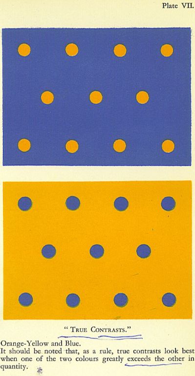
It is most important that the contrasting colours should be used in their natural order or the effect will be discordant. Full contrasts are not very common in Nature, certainly not in any quantity, whereas harmonies are to be found in every direction. The student will probably find by experience that he also will be wise to use contrasts sparingly.
Now and again a sunset will provide very wonderful and brilliant examples of full contrast.
The famous series seen in England some months after the eruption of Krakatoa showed such pairs as vivid red upon green-blue, orange-yellow upon blue, orange on cyan-blue, and purple on green. The last named, which is a singularly beautiful combination, may sometimes be seen when a part of the sky at sunset or sunrise, immediately before a heavy gale, becomes a clear, brilliant green. The effect of bright purple clouds driving across this is very magnificent.
Reduced contrasts, i.e., where one or both of the contrasting colours are somewhat broken, though still recognizable, are often to be found ; indeed, the more broken they are the more often they are to be seen. As examples, one may cite grass or weeds on purple earth. Both grass and earth are so much broken in colour that the contrast is not wearisome. In the case of orange-yellow clouds on a blue sky, the blue is often very much broken with warm light, so that the force of the contrast is greatly reduced.
Since a contrast must, from its very nature, give a certain shock to the eye, it ought to be looked upon by the colourist as a very valuable asset, and its position should be thought out most carefully, whether for a picture or for a design.
By way of exercise in the use of contrasts the student should set out a series of contrasting pairs of colours all round the circle, and he should test the relative effects of (i) equal quantities of each colour, and (2) a large quantity of one colour and a very small amount of the other. In practice the second colour may be laid as a band a little way inside the edge of a large patch of the first colour.
A further exercise will be to choose a colour and its two next neighbours in the circle, as well as its contrasting colour, and then to work out a simple arrangement. A whole series may well be worked on the same lines.
Table of True Contrasts Yellow.
Orange-yellow.
Orange.
Red.
Crimson.
Purple.
Violet. Ultramarine.
Blue (Cobalt).*
Cyan-blue (Prussian).*
Green-blue.
Blue-green.
Green.
Yellow-green.
* Cobalt and Prussian blue are the nearest equivalents in our colour-boxes, but Prussian blue tends to be dull. The transition from green to blue is more successful if made with Cobalt and Viridian.
Now and again a sunset will provide very wonderful and brilliant examples of full contrast.
Distribution
SUGGESTIONS FOR EXERCISES IN THE USE OF COLOUR
THE method suggested in the section on Harmony is probably the safest to begin with Pairs of tints, closely related and in their natural order, should be chosen, and arrangements of designs should be made from each pair so chosen. Orange and red, purple and violet yellow and yellow-green will serve as examples A red figure may be arranged against an orang background, a purple pattern may be worked upon a violet ground, or yellow, sunlit foliag may be painted against a green hillside.
The same exercises should be worked using the colours in different strengths pale, medium, and rich.
Two strengths of each colour may next be tried in the same arrangement. For example, the red figure may have trimmings of orange (both being rich and vivid), the background of a lighter tint of orange may have some kind of pattern, or some other variation, in a correspondingly lighter red. In the same way the design in purple and violet may contain certain figures, or an underpattern, in a lighter purple and violet.
This is a most useful exercise, because of the variations of which it is capable, and because it suggests so many possibilities. It is by far the best way to work all the early exercises in pure colour if possible let it be taken directly from the colour-box, so that the student may be able, freely and fearlessly, to use bright, fresh, and strong colour, for, unless he does so, he will never be able to face the greater colour problems which he will be called upon to deal with later on. Broken tints are very attractive, because a certain harmonious effect is comparatively easy to obtain by their use, but such effects may often be obtained by chance and the student is none the wiser. Pure, strong colour is generally enjoyed by young students, and, if they are regularly exercised in using it, they should attain to at least some degree of certainty in arranging strong, simple schemes, while, if they have a natural taste for colour, this early exercise may easily lead to a wonderful mastery of the most difficult problems.
After a set of exercises in very closely allic:d tints it will be well to work some experiments with pairs of tints which are separated by a short interval in the colour-circle, such as orange and crimson, or red and purple. Thee increased difference between the colours used will produce more variety in the arrangement made from them ; quick steps will take the place of slow transitions. The longer tl^e interval between the selected colours the moiie energetic will be the effect upon the eye, bit if the interval be made very long, and yet net long enough to produce a true contrast, the effect will be that of a jarring note.
DISTRIBUTION
BECAUSE the problems of harmony, contrast, and discord are so interesting,, one is easily tempted to forget that when colours are brought together the effect depends greatly upon the way in which they are distributed. Large masses of colour placed side by side will appear altogether different from the same colours arranged in narrow parallel stripes, and the effect will be different again if one of the two colours is arranged upon the other in a pattern of small spots.
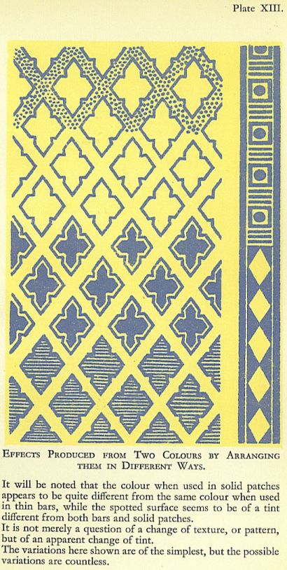
To test this, experiments may be made with any two colours. These should be arranged first in broad bands, chequers, and large spots. The stripes and spots should then be gradually reduced until the two colours are quite closely intermingled. After this, large spots of one colour may be surrounded by various textures formed as suggested above. It will be found that, when viewed from a sufficient distance:, these textures will appear to vary in colour. If three or four colours be used, instead of only two, the possible textures, and the corresponding possible new tints, are greatly increased in number.
This principle is of the first importance alike in picture painting, in decoration, and, particularly, in designing textiles and prints.
Nearly all surface decoration can be include]! under the two descriptions?stripes and spots? so that the probable effect of a propose arrangement may be tested without undu difficulty. By changing the textures a colour effect can be entirely changed, even though no alteration has been made in the colours employed. KEYNOTES OF COLOUR
WHEN it is desired to use a large quantity of a particular colour without giving the appearance of rawness, spots of the pure colour may be used and supported by broken tints of the same. Thus green spots supported by broken yellow-greens (lighter), and broken blue-greens (darker), will give a general effect of rich green, but much less raw than one plain space of unbroken green. Pure red supported by brownish reds and red-greys will similarly give a general effect of redness, but more or less sober according to the extent to which blue enters into the broken tints. The spots of pure colour have a stronger effect upon the mass than would the same amount mixed up in the broken tints.
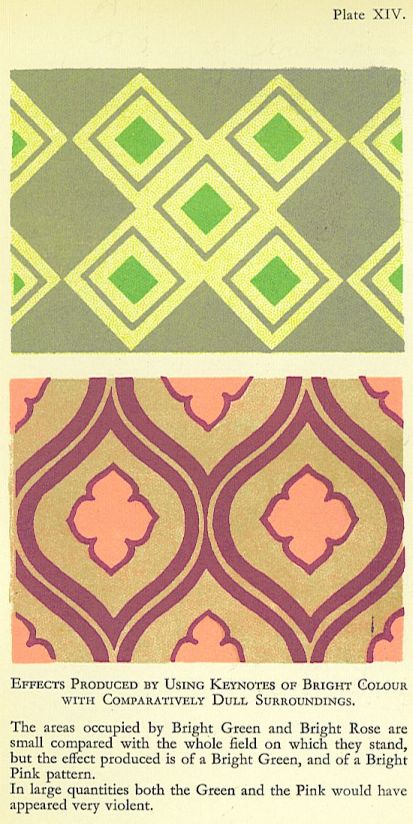
Keynotes of pure colour are also of great value in refreshing a scheme which inclines either to dullness or heaviness. The numbc:r and size of the spots must be determined by experiment in accordance with the degree of brilliance required.
DIFFERENCE IN TONE AND ITS EFFECT UPON COLOUR
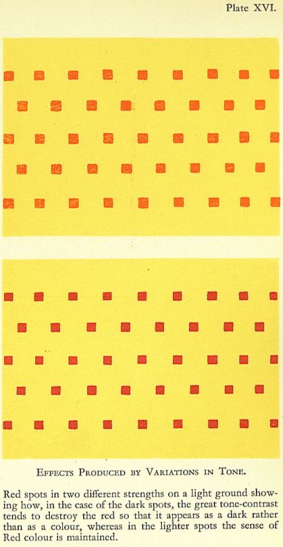
SHARP contrasts in tone tend not only towards violence of effect but also towards destruction of colour. Masses of dark violet on a ground of pale yellow tend to make the yellow look paler, while they themselves look blacker. Any dark colour placed upon a light colour tends to behave in the same way, so that, in practice, it is often necessary to reduce the contrast in tone in order to secure a satisfactory effect in colour. This is very noticeable in the case of dark reds, which, when placed on a very light ground, immediately tend to blackness, but which, when lightened, tend to regain their redness.
Unless a violent effect be deliberately intended, the tone-contrast between large masses of colour should be rather slight, but sharp contrasts in small quantities may be intermingled with far less loss of the desired effect.
This is best exemplified by reference to woven fabrics in which brilliant vibration may be seen as th result of close intermingling of light and dar colours.
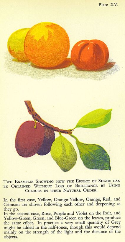
The effort to obtain relief, either in decora tion or in picture-painting, is often responsible for deterioration of colour. The best remedy is a close study of the natural order of colours, which shows how a change of colour should accompany a change of tone. If we follow the “order” it is possible to some extent to product the effect of shade, and the relief suggested by it, by a comparatively slight change of colour instead of a very marked deepening of tone. For instance, if in representing a yellow-green apple one side be made distinctly greener than the rest, that side will tend to appear as though it were somewhat shaded, and a little deepenin of the green will make the effect quite marked. Of course, reflected lights bring back the colour again towards yellow.
In any endeavour to arrange beautiful schemes of colour the influence of tone must never be forgotten ; indeed, it forms a foundation for the more advanced study of colour. Take, for example, a landscape?a summer morning, after the sun is well up?with blue sky, flecked with patches of misty cloud, some quite golden, some faintly rosy ; the lower sky so warm, and yet so clear, as to be quite greenish ; the distance full of rich blues and golden greens ; the nearer parts showing reds and oranges, full greens and deep purples. In such a case, yellow, rose, and purple will appear in the clouds ; yellow-green, greenish blue, and blue in the clear sky; yellow-green, green, blue-green, greenish blue, blue, purple, and violet in the distance ; and yellow, orange, red, purple, violet, yellow-green, green, blue-green, and blue in the nearer parts. These colours will probably be obvious, but many more intermediate tints will be present. Now it is evident that the same colours recur again and again in sky, distance, and foreground, but with infinite variations of their strength. The glowing orange in the foreground would be a heavy blot in the sky, and the delicate greenish blue of the lower sky would be a washed-ont patch in the foreground, but it is fatally easy to miss the precise colour values, whether strong or delicate, and to ruin the tone of the picture.
Colour-schemes for the decoration of rooms should be dealt with in much the same way as a landscape. The tone must be the first consideration. The broad, soft sweep of colour o the open floor of a large light drawing-room, with subtle gradations in walls and hanging^, may all be brought to nought by an unhapp splash in a pattern, or by some unlucky alie ornament.
The wonderful strength of nearly all the most famous portrait-pictures is due in greap measure to the mastery of tone. This is mos remarkable in certain full-length portraits. The face, quite a small spot compared with the whole area of the canvas, rules the whole picture, One thinks instinctively of Velasquez, of the Admiral Pulido Pare] a, or of little Don Balthazar Carlos. Some have suggested that in such cases colour is sacrificed for the sake of tone, but it would be far truer to say that the colour relations are so subtle that the tone is undisturbed. Probably in no direction has this truth been so forcibly brought home to us as in the works of the great Japanese masters. Appearing at first sight flat, they gradually reveal themselves as full of the most delicate variations, the commonly accepted changes attributed to the effect of light and shade being set aside in favour of most subtle gradations of colour.
To HARMONIZE JARRING COLOURS
IN practice one is often compelled to use to gether colours which do not perfectly harmonize, and it may be as well to note certain simple ways of overcoming the difficulty :
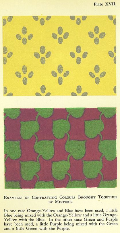
1. Mix a little of each colour with the other Full red and full green, laid side by side are apt to clash badly; but if one takes off the edge of the red with a touch of green, and the edge of the green with a touch of red, the result is a decided improvement.
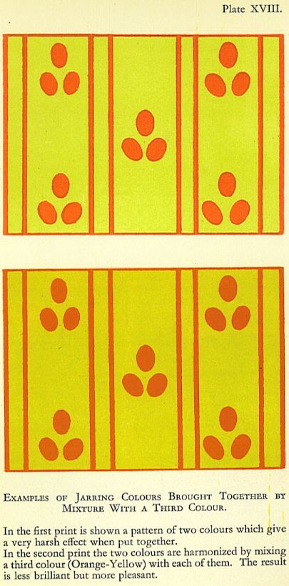
The operation, a mere question of the palette is as simple as it is obvious, but the resultant tints, though less trying to the eye, are les brilliant than the originals. If the original colours cannot be mixed, the desired result may be produced by working a delicate pattern hatching, or stipple of each over the surface of the other. The resultant in this case will be more brilliant than in the case of the actual mixture of the two colours. The reason of this difference in brilliance is simple, but much too important to be lightly passed over. The mixing of pigments sacrifices light, but the mingling of rays does not. If red paint and green paint be mixed together, the particles are so blended that they seem to obscure one another’s brightness, and the light given back from them is dulled; but when lines of red and green are alternated, the red and green rays given back by them are mingled in the air, and the resultant may appear even brighter than the original tints from which it was formed.
This is of great importance in estimating the carrying power of a colour, especially in such a case as that of a poster, in which it is essential that the glitter and brilliance of each tint should be felt as long as the poster remains in sight.
2. Mix a third colour with each of the original colours.
This is simply an adaptation of the ordinary effects of different coloured light upon a landscape, whereby a green tree and a red roof, yellow rick and a blue sky, are made to harmonize. Golden sunlight and grey mist both help to bring together colours not naturally harmonious. The same idea underlies the simple devices of covering the paper with a strong wash before starting a water-colour, or of glazing an oil-painting to pull it together.
As before, the result may be obtained either by actual mixture or by stippling, hatching, or patterning the third colour over each of the two original colours. Yellow-green and scarlet are not exactly harmonious, but they can be greatly helped by working blue over them both. The extent to which the third colour can be used can only be determined by the conditions and by the effect desired.
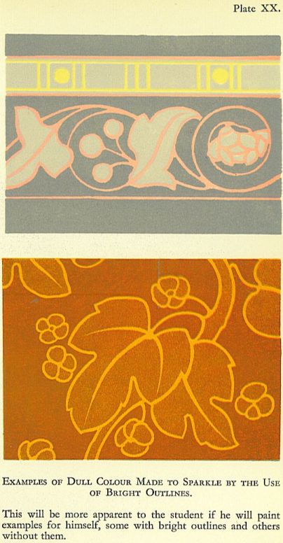
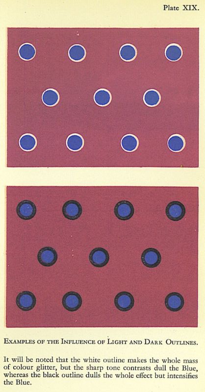
3. Use a well-defined outline to separate the jarring colours.
Though this is a distinct device it is nearly akin to the last in principle since it introduces a third colour.
The effect will be further altered and made lighter or darker in proportion as the outline is light or dark. Obviously, the broader the outline the more the effect will be altered.
The use of outline in this way deserves careful study. A group of colours which are dull, even though they do not jar, may be made quite brilliant and very attractive by using a broad outline of light or dark to separate them ; or, again, an entire group may be isolated from the ground in the same way. The effect of this is to supplement slow gradations of colour by sharp contrasts of tone, and to turn each patch of colour into a jewel in a setting.
The effect of a coloured outline may be to produce a wonderful glow, provided that the colour is bright enough, and that the enclosed forms are both small and numerous. To study this the same piece of design should be repeated, but with differently coloured outlines, and the effect should be carefully noted. The outline itself will not be visible at a short distance, but the change of colour resulting from its use will be very noticeable.
1. Mix a little of each colour with the other Full red and full green, laid side by side are apt to clash badly; but if one takes off the edge of the red with a touch of green, and the edge of the green with a touch of red, the result is a decided difference in brilliance is simple, but much too important to be lightly passed over. The mixing of pigments sacrifices light, but the mingling of rays does not. If red paint and green paint be mixed together, the particles are so blended that they seem to obscure one another’s brightness, and the light given back from them is dulled; but when lines of red and green are alternated, the red and green rays given back by them are mingled in the air, and the resultant may appear even brighter than the original tints from which it was formed.
This is of great importance in estimating the carrying power of a.
B
The operation, a mere question of the palette is as simple as it is obvious, but the resultant tints, though less trying to the eye, are les brilliant than the originals. If the original colours cannot be mixed, the desired result may be produced by working a delicate pattern hatching, or stipple of each over the surface of the other. The resultant in this case will be more brilliant than in the case of the actual mixture of the two colours. The reason of this colour, especially in such a case as that of a poster, in which it is essential that the glitter and brilliance of each tint should be felt as long as the poster remains in sight.
2. Mix a third colour with each of the original colours.
This is simply an adaptation of the ordinary effects of different coloured light upon a landscape, whereby a green tree and a red roof, yellow rick and a blue sky, are made to harmonize. Golden sunlight and grey mist both help to bring together colours not naturally harmonious. The same idea underlies the simple devices of covering the paper with a strong wash before starting a water-colour, or of glazing an oil-painting to pull it together.
As before, the result may be obtained either by actual mixture or by stippling, hatching, or patterning the third colour over each of the two original colours. Yellow-green and scarlet are not exactly harmonious, but they can be greatly helped by working blue over them both. The extent to which the third colour can be used can only be determined by the conditions and by the effect desired.
3. Use a well-defined outline to separate the jarring colours.
Though this is a distinct device it is nearly akin to the last in principle since it introduces a third colour.
The effect will be further altered and made lighter or darker in proportion as the outline is light or dark. Obviously, the broader the outline the more the effect will be altered.
The use of outline in this way deserves careful study. A group of colours which are dull, even though they do not jar, may be made quite brilliant and very attractive by using a broad outline of light or dark to separate them ; or, again, an entire group may be isolated from the ground in the same way. The effect of this is to supplement slow gradations of colour by sharp contrasts of tone, and to turn each patch of colour into a jewel in a setting.
The effect of a coloured outline may be to produce a wonderful glow, provided that the colour is bright enough, and that the enclosed forms are both small and numerous. To study this the same piece of design should be repeated, but with differently coloured outlines, and the effect should be carefully noted. The outline itself will not be visible at a short distance, but the change of colour resulting from its use will be very noticeable.
THE USE OF INTERMINGLED COLOURS
THIS should be studied regularly, not only by all engaged in practical design work, but by all who have to adapt, or to vary, the colour schemes of given designs, or who have to determine the causes of failure in producing desired effects.
It is evident that where a variety of tints is required in one pattern there will be greater outlay in production than where but a few tints are used; therefore if by using three colours in varying proportions we can produce seven tints, there will be some saving in the cost. This is, of course, perfectly well known in certain industries, notably the textile and colour printing trades, but it is not yet studied as fully or as systematically as it should be.
By way of experiment blue and yellow may be used. If three squares be filled with narrow lines of alternate blue and yellow in the proportion of
(a) two blue to one yellow, (b) two blue to two yellow, and (c) one blue to two yellow, the results will be (a) a broken blue inclining to green, (b] green, and (c) a broken greenish yellow.
This, with the two original colours, gives five separate tints instead of two, not to mention the variations of texture due to the size of the figures and the modes of grouping them. The addition of another colour to this experiment means an addition of six more tints due to intermingling, so that the total of tints at our disposal becomes three original and nine additional, or twelve in all.
Experiment in this direction is evidently worth while.
In practice the results of this intermingling can be very beautiful. They allow gradations and subtle variations of colour, so that with comparatively unpromising materials and limited resources quite charming effects can be obtained. Discords can be employed in this way to produce luminous colour.
REACTIONS
REACTIONS are responsible for the failure of many colour-schemes because of the extraordinary changes which colours appear to undergo under the influence of their surroundings.
After looking for a time at any strong colour the eye tends to see the opposite of that colouk If after looking at a strong red one looks at a fresh green, the green will appear bluer than it would if the red were not seen first. The direct opposite of red being green-blue, the eye is inclined to see that colour after looking for a time at the red, and so the neighbouring green will appear bluer than it really is.
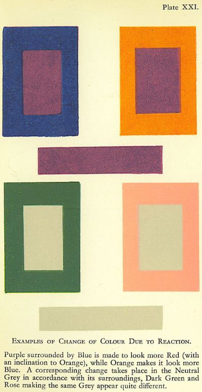
In the same way a mass of strong green-blue tends to make its surroundings redder. Rose against orange-red will appear more purple than when seen alone. Blue against strong, bright green tends to look more violet.
The remedy for this trouble is perfectly simple?merely add to the injured colour a sufficient portion of the colour which is causing the injury. Thus, a rose-tint which has been turned purple by the violence of a neighbouring orange may be restored by adding to it a sufficiency of orange. As the rose is warmed and reddened the purple effect will disappear. In practice this may be done either by actual mixture of colour or by intermingling by means of spots or fine stripes. Of course, if one were actually dealing with a delicate rose colour, it would be a matter for one’s own judgment to decide whether to mix orange with it or to substitute a redder tint for the rose, relying upon the force of the orange in making the red appear rosy.
Colourless spaces can be made to appear as though they were coloured by means of reaction from their surroundings. A space of neutral grey has, when surrounded by a bright and very greenish blue, apparently turned a reddish pink. A complete cure was effected by adding some of the same greenish blue to the neutral grey.
Similarly black, used side by side with greenish blue, has appeared quite rusty. This is a matter of very great importance to all who have to use colour in decoration, and particularly in printed or woven fabrics, for a good working knowledge of the reactions of colour will save much valuable time in seeking for the cause of a defect, and it may even prevent the spoiling of a quantity of valuable material.
It is hardly necessary to supply a table of reactions, as a thorough study of the table of contrasts, with a thoughtful application of its principles, will enable any student to determine the cause of a reaction and to find a remedy.
Ground tints are peculiarly liable to change when patterns are worked over them, and so utterly unrecognisable do colours become under such conditions that even the most experienced eye may be deceived. For a good example take an orange ground, cut it in two, and work a pattern over one half in strong yellow-green, but over the other half in strong reddish purple. If this is done fairly, the experimenter will find it hard to believe that he really used but one colour for the two grounds.
COLOUR-SCHEMES AS AFFECTED BY CONDITIONS OF LIGHTING
VERY few people, except: those who are called upon to face the actual facts, ever realize the extent to which colour-schemes are affected by the conditions of lighting.
Dazzling sunshine, pale sunlight, cold, clear greyness, heavy murkiness, reflections from blue sky, reflections from sunlit cloud?all affect colour differently.
The intensity of sunshine at its brightest is so tremendous that it seems to take the heart out of all colour which has no depth. For example, half-strengths of red under a blazing sun look utterly washed out, while a red of the fullest possible hue appears no more than reasonable. Similarly, full greens and blues will become quite quiet and satisfactory.
Of course, direct, strong sunlight adds a certain amount: of yellow to all colours upon which it falls, and this helps to bring together tints which would otherwise appear to be too far apart. Strong orange and purple, brilliant rose and yellow-green are all made more manageable under the influence of the yellow light.
The intensity of certain colours which occur side by side on some of the parrot tribe is easily understood if one thinks of them under the influence of brilliant, warm light.
Under the same conditions black loses its sombre character and seems to glow.
The choice of colours for dress is no doubt partly influenced by the conditions of light under which they are to be seen. Deep colours, as well as brilliant, are popular in Central Africa. Tints like those in a border of summer flowers are common enough in the hotter parts of India; but however strange some of the mixtures may appear to us when seen under English skies, there can be no doubt that they look perfectly right and quite beautiful when harmonized by the sun.
Those engaged in the preparation of coloured fabrics for export to tropical countries should give this matter their closest attention, for colour is certainly the attractive force, and unless the reasons for the choice be understood, it will always be difficult and risky work to arrange patterns, especially new ones, for these markets. As an instance, it has been found that although certain African tribes will buy some types of English prints, they will not use them until they have treated them with a deep blue dye of their own. Again, English firms are constantly called upon to supply, for India, patterns in which a particularly gaudy red and green predominate. Seen in a warehouse, laid out flat amid dingy surroundings, these cottons often look atrocious, but thrown into folds, and seen under strong sunlight, they are entirely transformed and become quite beautiful.
To test colour effects of such a vivid type the student should obtain pieces of dyed material and put them together in the strongest possible sunshine and in the open air. He will be surprised to find how crude greens, reds, and violets will blend, provided that the colour patches are not too large.
The grey light of this country is more: favourable to medium strength of colour and broken tints, and this is true in other countries under similar climatic conditions.
The most beautiful Japanese colour-schemes are remarkable for their restraint, and thougL some of the Chinese schemes are very clear anc brilliant they do not exhibit the tremendou force of those used under a fiercer sun.
A remarkable example of variation in the strength of colour, as used under different climatic conditions, may be seen in the North of Italy. In the high country around the lake broken colours and half-tints are most in. evidence. The natural surroundings are mountains and hills full of lovely greys and soft blues, which form a perfect setting for woods and gardens. Everything suggests beautiful but comparatively quiet, colour.
An hour or two by rail and one passes into a land of make fields, open and flat, under a blazing sun. With the changed conditions the dress of the country folk changes colour, and one sees vivid crimson and green, violet, orange and purple; but the eye does not shrink from them?the sun brings them together and harmonizes all.
Under northern skies strong colours appear again, not because of the sun, but for want of it. Darkness and cold and snow call for something to give brightness and warmth to the eyes, and the peasant dress of Scandinavia and Northern Russia shows a great partiality for bright colour.
COLOUR IN DARK SITUATIONS
DARK situations require strong, bright colour with sufficient contrast of tone to light up th darkness.
The old Egyptian schemes employed fo:r wall decoration are intended to be seen in deep shade. After the blinding glare outside, the Egyptian desired rest for his eyes, and so avoided windows as far as possible, but he did not wish for a dull, cold gloom, and therefore he used the richest and brightest colours to turn the heavy shadows into a rich bloom,, The strong red, blue, green, yellow, and white,, which strive so hard for mastery in an ordinary light, are quite beautiful in semi-darkness.
The same considerations have apparently guided the decorators of the finest of the ol houses of Cairo, in which the ceilings are treated with vivid colours and gold, echoed more soberly by the rich rugs upon the floor, the lovely, cool tints of blue, green, and white being reserved for the spaces opposite the eye.
The typical Persian scheme of rose, flame colour, white, and gold, upon a ground of lustrous blue, is also founded upon the same idea of darkness lit up by a glow of soft colour. Seen under the conditions for which it was planned, such a scheme must have glowed like a clear sky at nightfall.
The Pompeiian wall decorations which, when reproduced apart from their surroundings, appear rather garish, were designed for a reflected and not a direct light, so that, being placed in a rather dark situation, and lit by a warm reflection, the jarring notes would be brought together, and all undue brightness would be subdued.
This question of the use of colour in dark situations should appeal strongly to all decorators of public buildings, for churches, chapels, and public halls of all sorts afford problems in plenty. In many cases there is quite a large space between the tops of the windows and the top of the wall in which they are placed, and this space inevitably retires into darkness more or less intense. Again, the wall-space between two windows tends to darkness by force of contrast with the light on either side. In either case bright, strong colour may be used without appearing offensive, especially if due regard is shown for the effect of tone-contras A decoration composed of colours of nearly equal tone-values must needs appear flat to th verge of dullness under such conditions, where; a sharp tone-contrast will make the decorated space sparkle in spite of the weight of shade. The size of the coloured spaces used in th decoration must, of course, be carefully prc portioned to the conditions. The glare from a large window will drown all small forms in its neighbourhood. Not only must the colours be clear, but the shapes they fill must be larg enough and simple enough to hold their own. In church decoration the east wall of th chancel is usually the critical spot, for it is commonly seen under most trying conditions
The wall is so dominated by the light from the east window that no delicate tints or small forms have any chance of being seen. Examples are constantly to be found of work utterly wasted?lost in darkness which it does not even attempt to lighten. This is in some degree due to the making of designs without the least reference to the situation in which they are to be carried out, but a still stronger reason is the rarity of really good colour-planning. Churches are often worse treated in this respect than any other buildings, owing to the hideous medley of coloured glass in the windows. Usually florid, pretentious, and commonplace, these windows are seldom thought of as forming part of a complete scheme, but only as advertisements for the firm which supplies them. They are on a par with that class of ” decorations ” supplied, not because they are suitable, but according to a scale of prices?so much a square foot. Where it is not desired to put in a complete set of windows at one time, the scheme for the whole should be prepared so as to produce a united effect, and each addition to the coloured glass should be made in conformity to this scheme.
Well-chosen colour, of sufficient brightness but quite simply arranged, could be so used as to make the difficult east wall quite delightful to look at, and that without clashing with the window. The same type of colour, but of less intensity, could be used in the lighter situations. The tone contrasts would require to be modified to suit the light?stronger in the more distant parts or in the shade, and weaker in ordinary light and nearer to the eye.
Where it is desired to produce soft colour-effects in dark places, recourse must be had to the interlacing of varied colours at short intervals. Toned, and somewhat blurred, by the depth of shade, these colours will be united by the time they reach the eye, and will give the effect of a soft blend.
Dark situations in ordinary houses require to be treated on the same lines. For instance, the carpet of a room which is DIRTY COLOUR
DIRT has been well defined as ” matter out of place” and this is singularly true in the case of colour.
If we are dealing only with light and shade, we find that the presence of too much dark on the light surfaces, and of too much light in places which should be dark, produces an effect of dirtiness. The more patchy and irregular these false lights and darks are, the dirtier will be the effect. The removal of these patches will clean up the work most wonderfully.
In colour the sense of dirtiness is generally due to a failure to observe the natural order. The presence of dark yellow or yellow-brown in a space devoted to light reds, pinks, greens, or blues usually produces the effect of dirtiness. One of the commonest examples of this occurs in painting from life. A passage of delicate, warm grey in which touches of a dark yellow (or brownish) colour have been allowed to appear will surely look dirty. Touches of red, darker than their surroundings, placed in a cool, bluish-grey half-tone will look dirty.
At the first glance this statement appears to clash with the well-known principle in flesh-painting : ” Keep your shadows warm and your lights cool ” ; but, if we will take the trouble carefully to distinguish one passage from another, we shall find that yellows are backed by reds or greens a little darker than themselves, and that the reds are in turn supported by purple-reds, while the greens tend to blue. Cold high-lights on warm yellows or reds, and delicate, cool grey or bluish edges of halftones supply the slight but necessary discords.
In considering so difficult and delicate a question as this, one must remember that a light passage and a dark passage may each be complete in itself. One finds in certain dark complexions, it may be on the forehead and temple, delicate yellows deepening towards green, but all in a very light key, while close by, in the shadow of the jaw, will be dark yellows, much deeper than the green in the light passage. Examination will show that the dark yellows in the dark passage are backed by olive or green, or even blue-black, darker than themselves.
This principle enables us to understand how different masters of painting, with widely divergent tastes in colour, may yet work on the same foundation. Rubens, as we know, said, ” Paint your lights yellow and your shadows red ; afterwards, with a brush dipped in cool grey, go over the half-tones.” The late John Pettie, who, in his advice to students, devoted himself solely to colour, used to say, cc Paint your shadows yellow, for the reflected lights are full of it.” Each was right in his own way, though Rubens saw farther, and based his advice on a more profound knowledge.
Whatever considerations of luminosity may have prompted certain great painters to employ reds in the deep shadows of flesh, there can be no doubt that the presence of these dark reds helps greatly to put the dark golds in place without having recourse to blue, and, consequently, without cutting up the effect so seriously. Careful attention to the natural order will assist greatly in getting ” breadth ” of colour. The practice, so common of late years, of introducing many different colours into every portion of a painting and into every tint, however sober, is fraught with great danger to breadth, for in the hands of anyone but a great master the various colours are almost certain to slip out of their proper order and so neutralize the effect by appearing dirty. The beautiful sparkle and subtle gradation, which should have been among the great qualities of the picture, are replaced by a harsh, metallic glitter, with violent changes from point to point, while, worse than all, one is offended by patches undeniably ” dirty.”
Students will find that by practising fine and slow gradations of colour in its true order they can dispense with the multiplicity of varied tints, obtaining thereby quite as rich an effect with a much more powerful and dignified handling. When this method has been mastered, it will be an easy matter to get broken colour where it is needed, and to add the necessary discords without harshness.
Dirty colour is much in evidence in different kinds of patterned materials. Cottons and silks, carpets and wallpapers, are often to be found suffering from this bad fault.
The most common cause is the wrong use of greens and browns. If we divide greens into two classes, warm and cool, we can easily analyse them. Warm greens contain more yellow, and frequently some red, while cool greens contain more blue. The warm greens, therefore, belong to the upper end of the scale and the cool greens to the lower. If we make our warm greens deeper than the cool, we reverse the natural order and produce a discord. It is quite common to find a mass of light, cool green with large spaces of dark, warm green side by side with it, and the result is unpleasant, both colours suffering. In the same way dark, warm browns are often used with light and rather cool greens, the result being that the greens become cold and dead while the browns become hot and sometimes perfectly bilious. If the browns are cooled down?blue added to their composition will effect this?the result is less objectionable.
The nearer the discordant colours are brought to neutral grey the more nearly do they become harmonious, but the student must take warning that it is fatally easy to make greys look dirty by neglecting the natural order. Many a tint which ought to be quite silvery only succeeds in looking cold and dowdy because the foil chosen for it has been taken from the wrong end of the scale.
The free use of pale blue or blue-grey, side by side with deeper tints of green, red, or yellow-brown, is almost certain to result in making these other colours look dirty. To sum up, one may say that dirty colour is usually the result of using dark discords, i.e., tints darker in relation to their surroundings than they should be according to the natural order.
It is, of course, quite possible to use dark discords deliberately when it is desired to place dark spots upon a light, cool ground, but it must be done with moderation and with great judgment.
well filled with furniture, and not very strongly lit from the window, may contain brighter colours and sharper contrasts than would be bearable in a light room with little furniture.
Curtains hanging on the darkest wall of a room, on either side of the windows, may have more colour, more variety of colour, and more tone-contrast than is commonly thought to be safe. Placed as they are, the varied colours or contrasting tones readily blend, and if placed against a comparatively simple wall give just the note of richness and variety which the eye craves.
BLACK AND WHITE
ANY survey of the effects of Colour would be incomplete without some consideration of the influence of black and white. A reference to Nature reminds us of the magnificence of great white clouds above a deep blue sea, of sheets of white daisies on fields of glowing green, of the dancing flicker of white butterflies in a garden, or of the spangled silver of white flowerets in the hedgerows. We think, too, of the splendour of black cattle on the skyline of a moor, of the flashing sables of a magpie as he shoots like a black meteor across our path, or of the sombre grandeur of a mountain tarn hiding its black depth in the shadow of overhanging crags.
Evidently we cannot afford to neglect black and white, and indeed we know well the force of them in practice, for the black robe and the black horse have touched man’s imagination for ages, and “white as linen,” or “snow-white,” are household words.
Many painters and designers have recognized the value of masses of black and white in giving value to their pictures or decorations, for black and white form an admirable foil for colours. The change to either of them after some positive colour is so great that the eye returns from it refreshed to find the colour brighter than before. The familiar Union Jack owes much of its brilliance to the presence of white among the reds and blues. The red, white, and blue of France, and the red, white, and green of Italy, are pleasing for the same reason. So great is this influence, and so effectual is white when separating opposing colours, that even a group of jarring tints can be redeemed to some extent by fencing each of them with white ; indeed, it has grown to be a proverb that “white harmonizes all things.”
Black also is wonderfully effective as a foil. It was much used in the Pompeian decorations, especially as a ground for schemes of light colours. At the present time it is used freely as an outline in cotton printing, and although this is done first of all to cover the overlapping of colours, or the flaws where they fail to meet, yet great reliance is placed upon its effect in making the design appear more brilliant.
By way of a test the student should take a colour-scheme in which some feature lacks the importance which it ought to have, and, cutting out a white or black patch of suitable shape, he should fit it round the weak spot. The immediate isolation of this piece will give it an unexpected importance which may even transform and redeem the whole scheme.
The outlining of small patches of colour with white or black tends to make them more jewel-like, provided that too many of them are not packed together, for if this be done the outlines will tend to merge into the patches and the whole effect will appear dulled by the black or thinned by the white. An excellent example of the right use of a black outline is to be found in the leading of a stained-glass window.
This tendency to merge can be utilized to great advantage where one has to produce a variety of effects with very few colours. In colour-printing it is necessary sometimes to use only one colour with black on a white ground, but experiment proves that with these three we can get several other tints.
If we begin with red, white, and black, we can use red spots on white, white spots on red, red lines on white, and white lines on red. Then red spots can be edged, barred, or dotted with black, producing three distinct effects and changing the apparent quality of the red in each of them. Already we can count ten varieties of surface, and by reversing the positions of black and white we can make still more. Even the variations of bars, rings, fine lines, dots, and so on, of white upon black, or of black upon white, tend to produce a sensation of colour. The change of surface quality produced by varying the pattern of white, black, and colour, laid one over another, seems endless, and its possibilities have not been exploited nearly to the extent they deserve. The variations in the quality of a colour when edged, laced, or dotted with white or black are both interesting and valuable. It will be remembered that to mix white with a colour in painting not only lightens the colour, it also changes the tint. Vermilion and white produce a rose tint; rose madder and white produce a purple tint. In the same way fine lines of white alternating with vermilion produce a tint not merely paler but more pink. All this may be summed up by saying that the presence of white among colours, particularly at very short intervals, tends to cool as well as to lighten them. On the other hand the presence of black, even though it may not add much warmth, produces far less coolness than white. To the weaver and the house decorator experimental knowledge of these matters is essential.
Black and white together, in quick alternation, produce a glitter owing to the sharp contrast between them, and this glitter may be used to give a welcome relief from the glare of a solid mass of colour. It can be used with brilliant effect as a border, but, like other good things, it may be easily overdone. It must never be forgotten that black and white, in common with all neutral tints, are very liable to be affected by reaction from bright colours when placed side by side with them. Thus a patch of white surrounded by violet-blue tends to look yellowish, but if surrounded by golden yellow it will turn towards blue. Black in the midst of green-blue becomes quite rusty, and, although by reason of its depth it is less sensitive than white, there is no doubt ‘that any strong colour will affect it in some degree. If we wish to avoid this effect, the white or black must be slightly tinted with the surrounding colour. The result will be the restoration of the natural appearance of black or white.
The experiments suggested in this chapter, and indeed throughout the whole book, are very far-reaching in their effect, and the student will discover a wealth of new ideas if he will but carry them out; but the casual reader who does not test the suggestions for himself will gain little. Words read are easily forgotten, but experience gained lasts a lifetime. Moreover, each experimenter brings his own personality to bear on the problem, with the result that, however old the experiment, new beauties are constantly being discovered, and the joy of discovery is beyond price.
Examples
EXAMPLES OF APPLIED COLOUR
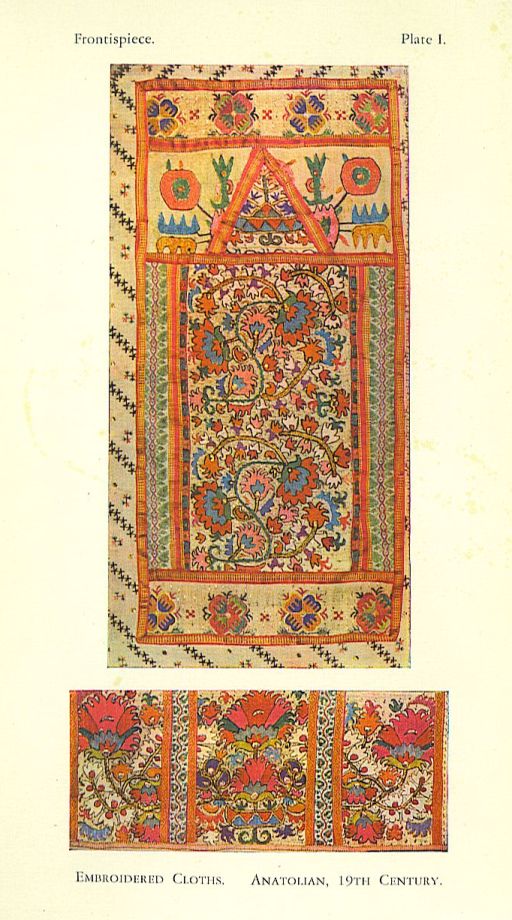
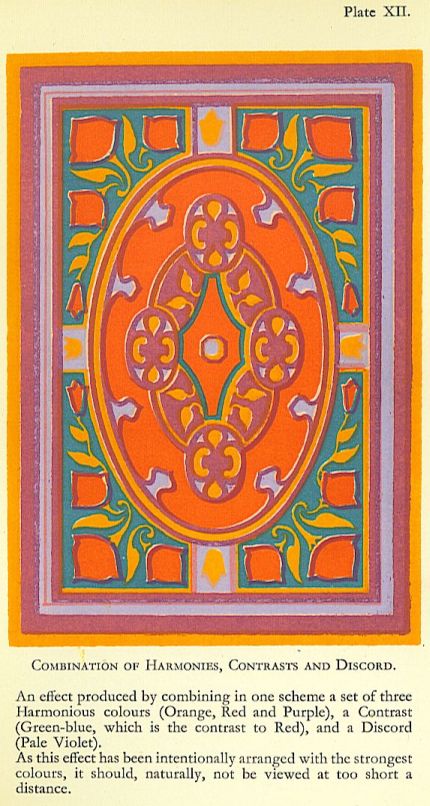
THE examples of applied colour which have been included in the present edition of this book have been chosen from Eastern sources, generally less familiar to the student than European work. They illustrate colour-schemes founded upon the three great principles of Harmony, Contrast, and Discord, as deduced in the preceding pages from the Natural Order of Colours. A wide field in applied design is covered, comprising Anatolian embroideries, Persian faience tiles, and Indian applique work, with carpets and embroideries from China, and silk brocades from Japan. A short analytical description of each example is provided in the notes that follow.
PLATE I
Frontispiece
EMBROIDERED CLOTHS, ANATOLIAN, NINETEENTH CENTURY
Gaiety without crudity is achieved in the uj-per subject by the use of Reduced Contrasts in small quantities and in a great variety of tints. The choice of colour for the background prevents any startling contrasts of tone. In the lower subject, despite the cool and subdued tints of many of the smaller forms, the pattern arrests the attention by its fiery brilliance. This is produced by the modified Discord of cerise with orange-red, used in fairly large adjacent patches of almost equal tone.
PLATE XXII
PERSIAN FAIENCE TILES, EARLY NINETEENTH CENTURY
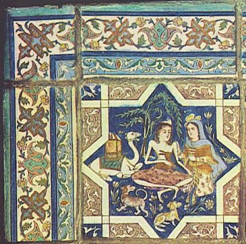
The whole composition is kept, as it were, in a minor key, so that it requires more than a casual glance to detect the delicate passages of Discord which enliven the subdued harmony of the main scheme. Especially interesting are the distribution of colour, and the resultant variety of tone and texture.
PLATE XXIII
INDIAN PANEL OF APPLIQUE WORK ON FELT
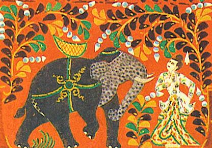
The colour-scheme in the upper part of the panel suggests the quiet glow and shimmer of certain metals against a rich depth of background. This band, with its sober restraint, makes an admirable foil for the somewhat hard glitter of the lower section, where are shown those more violent oppositions of colour and tone which call for the harmonizing effect of an Eastern sun.
PLATE XXIV
WOOLLEN CARPET, CHINESE, EIGHTEENTH CENTURY AND PARTS OF SILK EMBROIDERED CHINESE GARMENTS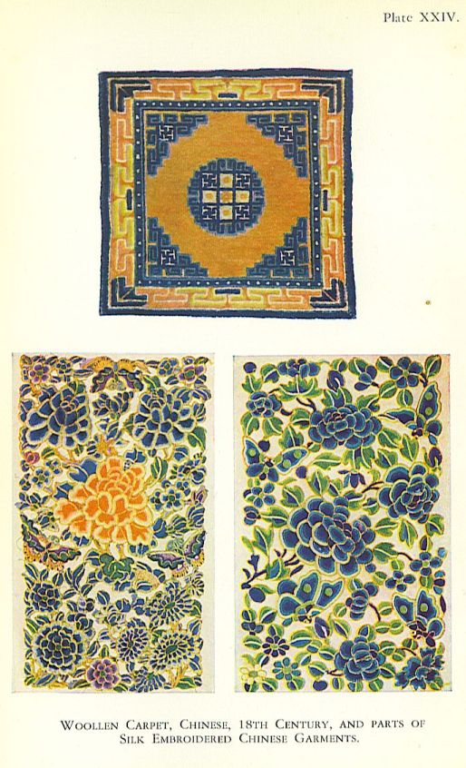
These lovely examples of Chinese colour-schemes exhibit a clarity and brilliance which is yet quite distinct from the tremendous force of the Indian panel on Plate XXIII, or the gaiety and glow of the Anatolian embroideries in the frontispiece. Once again the principles of Harmony and Contrast are demonstrated, but both choice and distribution of colour are the products of a different mentality in a different environment.
PLATE XXV
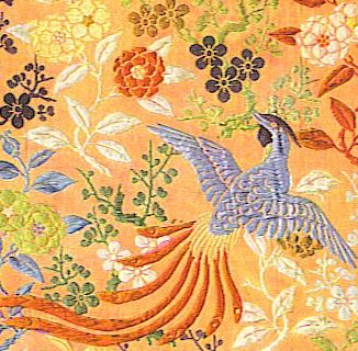
SILK BROCADES, JAPANESE, EIGHTEENTH CENTURY
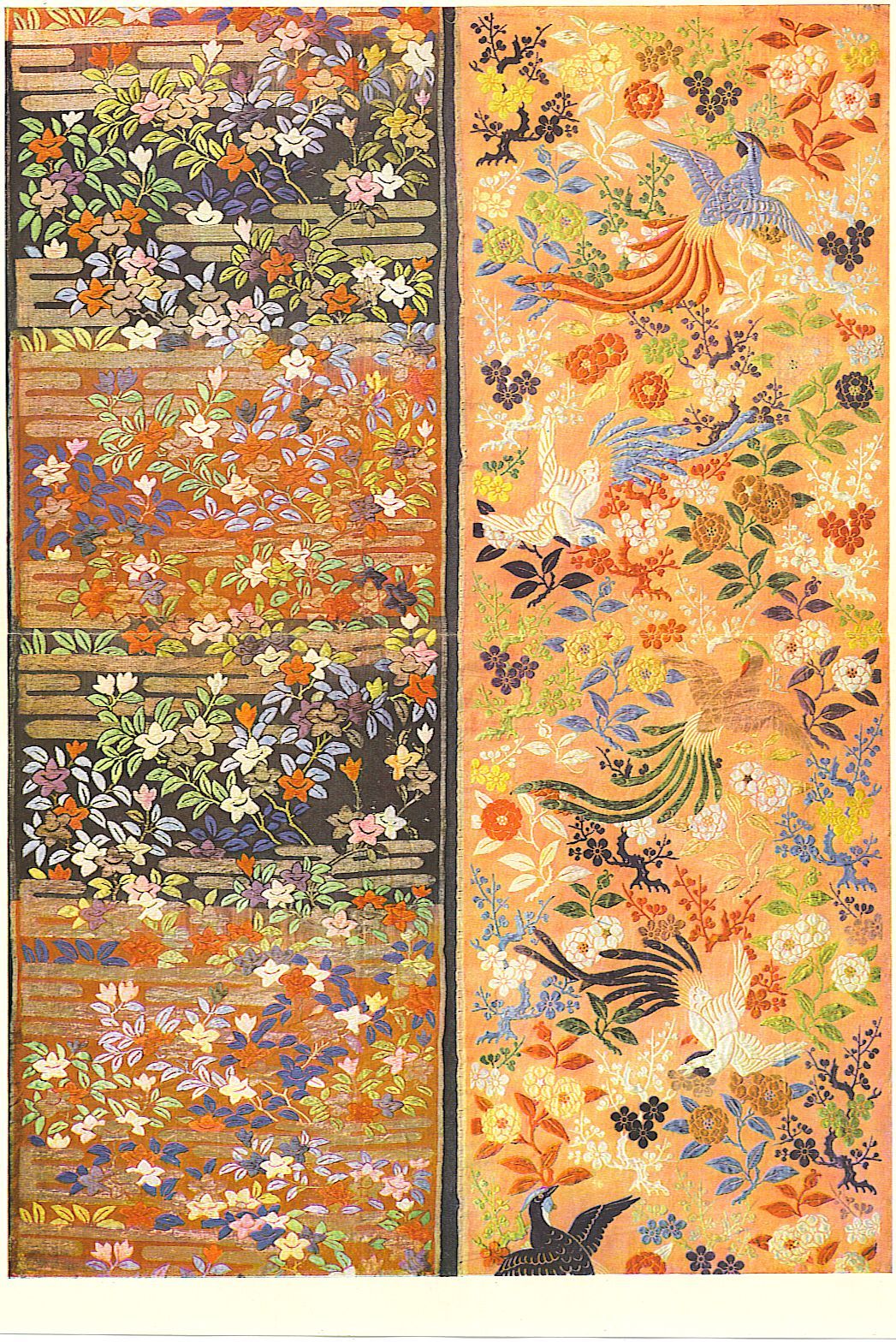
The charm of these designs arises as much from the exquisite distribution of tone and colour as from the dainty variety of small forms. Particularly noteworthy are the use of black and white, and the effect of ” bloom ” produced by Discord.