
BOOKCOVER DESIGNING
published in 1905 by the International Correspondence Schools Reference Library
This chapter on BOOKCOVER DESIGNING also includes a sub-chapter on Ex-Libris design which I have included in the essai as it is originally part of it.
It is presented here in its original form, as it was published 100 years ago.
BOOKBINDING , EARLY STAGES OF THE ART
Character of Bookcover Design. The modern designer of bookcovers, book plates, and other productions of the printing press is confronted with a problem entirely different from that demanding solution by the designer of repeating ornament.
Bookcover designs usually contain, first, the title of the book, and second, some piece of characteristic ornament that is in harmony with, or symbolic of, something contained in the book itself, or the subject on which it treats, or of the series or set of which it is a unit. A book plate differs from a bookcover in the fact that it usually faces the title page and its elements are characteristic of the owner of the work, and are not associated with any detail in the narratiye.
The initial letters that are sometimes used to head the chapters may be associated with the same ideas as the cover, or they may consist of simple abstract ornament in no way associated with the chapter that they introduce.
It should be borne in mind, however, that while harmony of idea is not demanded, discord must be avoided, 2nd a book the contents of which is suggestive of classic history or art could not be printed with initial letters designed in the Gothic style, except through a violation of the fundamental principles of design.
Origin of Bookbinding.
It must also be borne in mind that every device of a utilitarian character had at the time of its origin a primitive form, and the associations of this form, from its origin to the present day, have had more or less influence on the character of its design. The old methods of engrossing on parchment facts for preservation, made these documents very rare and valuable, and the scrolls on which they were usually written were wound around a stick and placed within a metallic tube in order to preserve them. The makers of these metallic tubes, usually silversmiths and goldsmiths, therefore were in reality the first bookbinders. In later periods, pages were engrossed similar to those in our paper books and bound together to form a volume not unlike our common books of today. But still the binder was employed only to sew the pages together, and the silversmith and goldsmith did the elaborate work of designing and fitting it to the book. Naturally, these volumes were a very expensive lot of documents and could be possessed only by the most wealthy.
The introduction of printing and the printing press brought books within the reach of everyone and revolutionized book printing, bookbinding, and bookcover designing. Character of Early Bindings.-In the earliest times of bookbinding, the work of the cover was in the hands of the leather worker and the goldsmith, as the bookbinder, as understood by us at the present day, had not then come into existence. Rare and beautiful volumes, representing hours and hours of laborious productions of the scribes and the artists, were incased in befitting covers of gold and silver or ivory, and frequently enriched with precious stones. Such volumes were obtainable only by the king, or, possibly, the library of a church or monastery. When princes and nobles took an interest in matters literary, as they did at a subsequent time, manuscripts became more common, and these costly bindings were superseded by bindings of velvet and satin and, afterwards, by leather. The invention of printing, making books producible in a large quantity, made a still less expensive material desirable, and leather formed the binding material of nearly all books, but the decorative work was carried out on its surface in gold leaf and enamel colors. During the time of Charles VIII and Louis XII in France, many books were collected for the royal library, and Anne of Brittany, who was the wife of each of these monarchs and shared w~th them the love of literature, bought and ordered specially printed volumes for her library.
Heraldry in Bookbinding.
It will be necessary to consider only a few of these early bindings in order to obtain an idea of the great pains that was taken with this class of work, and to understand that the style of ornament prevailing in each particular period influenced bookcover design more than did the contents of the book itself. The fact that the books were bound individually and not in numerous quantities, led each king or queen to stamp on the cover his or her coat of arms or initials, and this serves to identify many volumes for us at the present day. Stamping the owner’s coat of arms or initials on the cover of a book was in reality the prototype of our modern book plate, for the book plate stamped on or in a book is usually placed there as a mark of ownership rather than in any way relative to the subject bound.
Early Designs Governed by the Tools.
To fully understand the character of early bookcover de:oigns in leather and gold, it must be borne in mind that the limits of the design were governed very largely by the tools in use by the leather worker. This term tools refers to the implements on the end of which little devices, or ornaments, are cut; each tool is separately used to transfer the design to the leather.
When leather was first used as a bookcover material, most of the work was done in the monasteries, as there were no regular binderies at that time. The designs that these monks and craftsmen invented were made up largely of motives borrowed from manuscript, initial letters, etc., and from carvings in wood and stone that they would naturally observe in the various churches and monasteries.
Influence of Increase of Binding on Character of Design.
The love of learning and the spread of books became so important, however, that the monastery workshops were unequal to the task, and leather workers of all sorts were pressed into service to bind the numerous books that were springing into existence. Saddlers, harness makers, and even bootmakers were called on to do the work, and the new trade of bookbinding was influenced not only by their skill as craftsmen, but also by the character of the tools that they had been using in their various crafts, and to a certain extent by the designs that they had used for years in the ornamentation of boots, saddles, and harnesses for royal personages. The artisans themselves were humble men, few knowing even how to read and write, and we therefore find the earliest leather bindings stamped with devices that are in no way relevant to books or book work, but that have become characteristic of bookbindings of the present day simply on account of this original association.
The binder being familiar with the extent to which he could interchange his tools, conceived the general scheme of his .cover decoration, then by a combination and repetition of the forms on these tools created his design. These designs therefore varied according to the fertility of the mind of the designer and the prevailing tastes of succeeding periods of time. It is necessary, therefore, that familiarity with these tools should be possessed by the student in order that a real understanding of bookcover designing may be attained.
Origin of French Tools.
In the period of Louis XII of France, the forms of the tools used were borrowed from Italian devices, wherein arabesque figures were stamped in black on white paper; but the French worker soon learned that this heavy black mass, though suitable to a white page, was utterly unsuited for stamping in gold on the cover of a book. It therefore was usual to stamp the devices in outline, or sometimes in outline with the interior slightly azured, as this form is technically known, thus giving the binder not only a means of varying the weight of his device but also a variety by a combination of which strength or lightness was acquired.
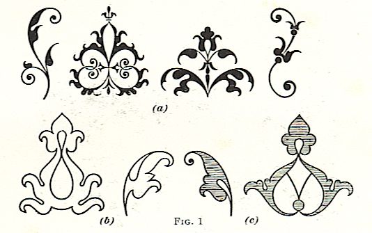
These tools in their three forms are illustrated in Fig. 1, where at (a) are shown the tools as derived from Italy in their solid form, at (b) their variation by simply the use of outline, and at (c) their further variation by the shading of the outline in order to give a little more strength. The form of these devices is plainly borrowed from the arabesques of Italy, and, separated from the elaborate interlacings with which they were there associated, show their outline to be distinctively of oriental or Arabian origin, from which they derived their name as arabesques. These simple devices connected by a long line of scrolls and interlaced bands formed the entire theme of bookcover design during the first period of the French Renaissance.