
Grolier.
The styles of bookcover design that prevailed in different periods, unlike the style of ornament that is characteristic of each period, usually take their names from their designers rather than from the ruling monarch. For instance, many of the bookcovers made during the reigns 7 of Louis XII and Francis I are designated as the Grolier style, inasmuch as the art was introduced into France from Italy by a great collector of books, named Grolier; this style includes both the prevalent character of binding found in Italy and a later style in France.
Grolier assisted in the production of many volumes that were printed on the press of Aldus lVlanutius, a celebrated Venetian printer, and in recognition of his services many volumes were beautifully bound for Grolier’s own library. In the year 1545, Grolier obtained the position of Treasurer General in France, and held it until his death, in 1565, thereby establishing his great library of three thousand volumes of fine Italian bound books in the heart of France, near Paris. These books were mostly bound in morocco, the finest skins for which were procured from the Orient, though a few were covered with calfskin, the earlier works possessing the characteristics of the Italian Aldine press, the later ones being modified under the influence of binding in France.
Characteristics of Italian Bookbinding
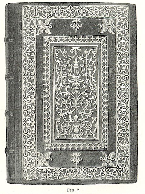
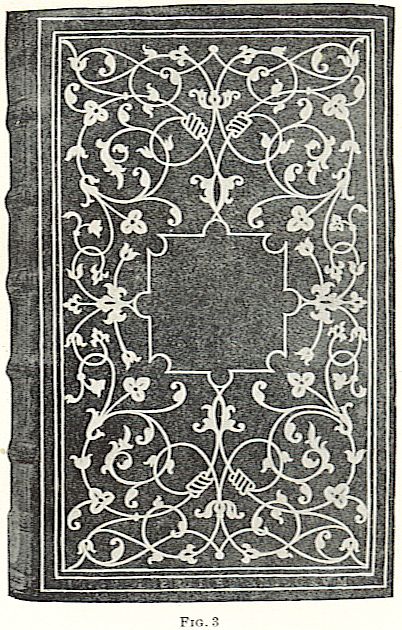
In Fig. 2 is shown a binding in the Italian style on a book printed in Venice in the year 1521. This shows the characteristics of this Italian work and the form of arabesque patterns that were introduced into France during the reign of Louis XII. Here are seen the impressions of the tools of the Aldine press, pointed out in Fig. 1 (a), united with the scrolls and arabesque panel ornament characteristic of the Italian Renaissance. In Fig. 3 is shown another design from Venice bound for Grolier, whereon a panel is left in the middle that subsequently might receive a coat of arms.
Here the tools are still similar to those used on the Aldine press and give a fair idea of the style of book design when first introduced into France.
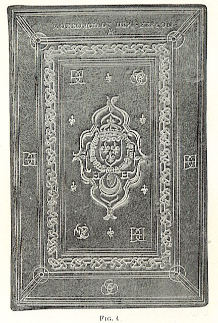
In Fig. 4 is illustrated a book that was bound under orders off Henry II for Diana of Poiters to be placed in her library, and stamped on its cover are the interwoven initials H and D indicative of these two names, while in the upper right-hand and lower left-hand corners of the central panel are the three intertwined crescents of the coat of arms of Diana. The cover of this book was of citron morocco and is a characteristic binding of this period, 1545.
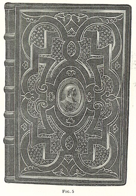
The bookcover shown in Fig. 5, bound in 1556 for Henry II, shows a type of ornament entirely different from a profile portrait of the king himself. This cover was of brown morocco leather with painted bands and gilt trimmings; except the portrait, no initials or other devices were placed on the outside of it. The bookcover shown in Fig. 6 was bound in 1562 for Katherine de Medici, and the coat of arms on its center was that of her family. The back of the book was ornamented in each panel with a crowned K, the initial of her
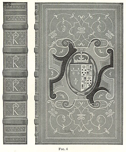
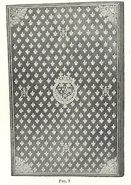
name, and the whole was executed in dark blue, green, and gold on leather of olive morocco; however, the central oval panel around the coat of arms was painted red. In Fig. 7 is shown a design executed in brown morocco for Henry III, with gilt ornamentation including ciphers and fleur-de-lis forming the ornament on this design partake of the character of a spot and powder design limited at the angles by especially designed corner pieces.
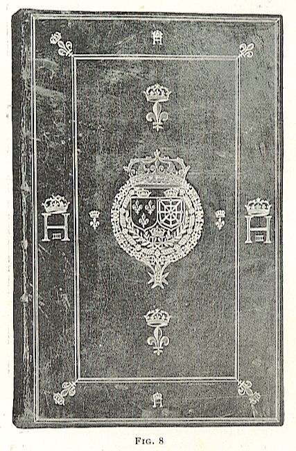
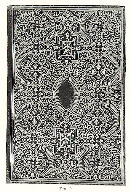
In Fig. 8 is shown a design executed in red morocco for Henry IV, in 1604, the central ornament being composed of his coat of arms: in the outer limits of the border surrounding it are found his initials intertwined with those of his queen, Margaret of Valois.
The change in the character of design at this period can be readily compared by reference to Fig. 9, which is a design in brown calf executed for Margaret of Valois, 27 years before that shown
In Fig. 8. The tendency throughout simplicity rather than complicity-is well illustrated.
Tendency of Bookbinding.
The earliest efforts to enclose books in suitable and appropriate bindings tended to make those bindings and cover designs more
characteristic of the owner of the book than of the book itself, and each design being executed but once, and that on the bookcover itself, rendered it advisable to spare no monev in order that the quality of the cover should be suitable with the value of the work it protected. At the present day, however, we have an entirely different proposition; our books are printed in editions varying from one thousand to ten thousand copies, and some limited editions of a few hundred copies. Our cover designs must therefore be reduced to the limitations of practical printing and at the same time be suitable and attractive.
Some of these covers
are printed on paper, others on cloth, others on parchment, and a few, even at the present day, on leather. In most cases, these covers are backed up with a heavy cardboard or pressed-paper filling, and the material, as well as the design, serves not to protect the book, but to ornament its outside, the true cover being the binding material itself.
Limitations of Field of Design.
The designing of bookcovers is practically unrestricted. There are no considerations of proportion concerning its dimensions that need in any way affect the relative details of the work. The design may be executed in black and white, in gold, or in color, the only considerations necessary being the expense of production and the handling of the material in a manner suitable for the die press.
Certain classes of bookcover design require an imitation, perhaps, of what has been done in the past, such as the examples shown; other classes may require the enclosure present day, however, we have an entirely different proposition; our books are printed in editions varying from one thousand to ten thousand copies, and some limited editions of a few hundred copies. Our cover designs must therefore be reduced to the limitations of practical printing and at the same time be suitable and attractive. Some of these covers are printed on paper, others on cloth, others on parchment, and a few, even at the present day, on leather. In most cases, these covers are backed up with a heavy cardboard or pressed-paper filling, and the material, as well as the design, serves not to protect the book, but to ornament its outside, the true cover being the binding material itself. with come, piece” in which each of the design may partake of the character shown in FIg, 48 of Practical Design;
a simple design in appropriate historic letters would also be perfectly proper without any ornament whatsoever, or, possibly, this style of letter with a slight interweaving of historic ornament. In any case, the designer left almost entirely to the dictates of his own ideas henced by the character of the book for which he is to design, and a few suggestions. is all that will be necessary in order that he should learn to apply the principles of design to this class of work.
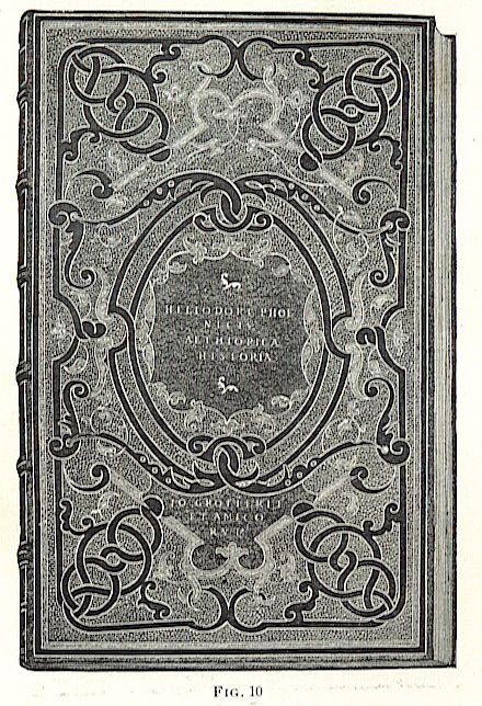
In Fig. 10 is Shown a binding executed for Grolier, in which the lightening of the tool effect by means of outlining is very apparent; a heavy black interlaced pattern is stamped on the leather, the background is powdered, and the tools outlined in gold and their interior powdered. The Italian motto, “Io Grolierii et Amicorum,” is stamped on nearly all of Grolier’s books and, in reality, represents his book plate.
Francis I Bookcovers.
During the reign of Francis I, the influence of French taste on bookbinding is seen by the introduction of powdered devices for books.
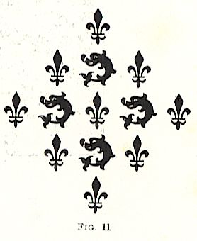
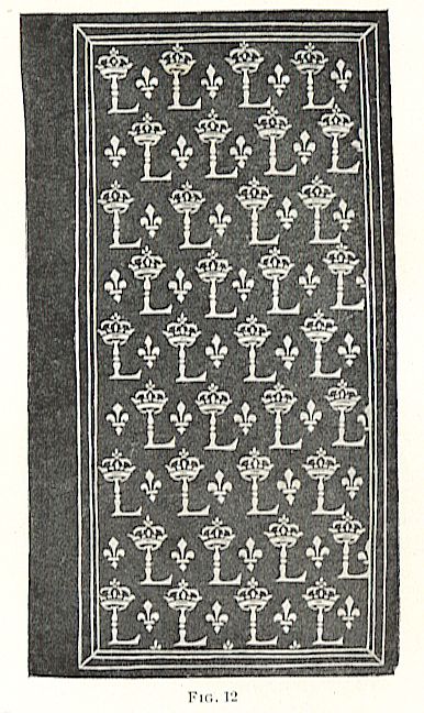
In Fig. 11 is shown a powder effect within the dolphin device and the fleur-de-lis are alternated vertically and horizontally; this device m vaned forms was very popular in subsequent periods, as may be seen in Fig.12 which was a binding for Louis XIII, wherein the powder effect is secured by means of the fleur-de-lis and the crowned L. Other devices were used in powder effects and also interwoven in arabesque design, as the double H of Henry II, the interwoven crescents of Diana of Poitiers, and the H C, and L A for Henry and Catherine, and Louis and Anne of Austria, in their respective reigns.
Le Gascon and De Thou.
After the time of Grolier, whose name is associated with all French bookbind?ing, up to the period of Charles IX, Le Gascon and De Thou appear prominently as book collectors and inf1uencers of bookcover design.
Jacques August De Thou was appointed to the custody of the books in the library of Henry IV, and it is to him that we are indebted for the preservation of nearly the entire library of Katherine de Medici.
Styles of Henry II and Henry IV
It was after the reign of Charles IX that a change of style began to take place in French bookbinding. The sides of a book were divided into small compartments by geometrical lines, and though at first these compartments were devoid of ornament, during the reign of Henry III they were occasionally filled with a stamp representing the crucifixion. Henry II frequently bound books for himself on which he stamped the triple crescent of the coat of arms of Diana of Poitiers; but his son, Henry III, took life more sadly and decorated his covers with religious subjects and skulls until after he became king, when the designs became more cheerful, as shown in Fig. 7.
Style of Margaret of Valois.
Margaret of Valois, sister of Henry III, bound her books with a powder design composed of marguerites or roses enclosed in ovals of conventional leaf-like forms. She also endeavored to relieve the restraint caused by the regular framework by entirely filling its spaces with foliated figures and a multitude of vines that were extremely graceful.
Fanfares.
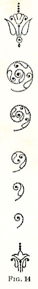
The style of binding found on the books of De Thou is termed fanfares, on account of that word appearing prominently in the title of one of the earliest volumes bound in this style. They furnished models for other books, and a binder known as Le Gascon, who was probably an apprentice of the binders that worked for De Thou, introduced them into his designs extensively. In fact, the execution of this style of binding made Le Gascon the most prominent person in bookbinding after the days of Grolier. But it must be remembered, however, that Grolier was a book collector and not a binder and that through his efforts a style was developed that made a great binder like Le Gascon a possibility.
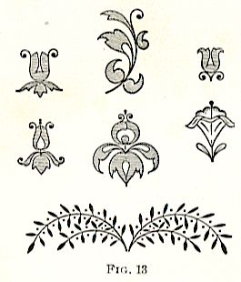
In Fig. 13 are shown the tools used in the execution of these fanfare covers, all of which, except the little branches, are azured or ruled with a light surface tinting. Le Gascon developed these tools into still lighter forms, by dotting their outline so as to make it as delicate as possible, as shown in Fig. 14. He developed great individuality, but always employed the stiff framework of the fanfare on important bindings. His style gradually developed, how?ever, and the reduction of the Aldine tools to the dotted outline is characteristic of his work and gives a remarkable brilliancy of effect to the best of his bindings.
Style of Louis XIV.
The beginning of the reign of Louis XIV, when Le Gascon was binder to the king, might be considered the period of the highest development of French literature. In bookbinding, however, it was literally a golden age, as the application of heavy stamps and gilding rendered the bindings less delicate than their predecessors and in certain instances positively vulgar in their glitter. The royal arms were stamped on the covers in exaggerated proportions, and heavy borders of gold in geometrical patterns were printed around the edges. These borders, being printed from revolving wheels, were absolutely uniform and lost the charm that is ever characteristic of purely freehand work.
In some examples, where the courtiers followed the style set by the king, a border varying in width from 1 to 3 inches was run around the book by means of one of these wheels. Sometimes there would be two or three narrow borders, one within the other, usually with a heavy corner piece to mark the return, but very frequently without any attempt at a corner piece at all, allowing the corners to take care of themselves where the ruled ,york stopped. Sometimes the entire side of the book would be engraved in this incongruous style of repeating ornament, making the bookbinder a mere machine without an opportunity to exercise skill or taste and rendering all books so alike in character as to make them appear commonplace.
As a consequence, we find no great bookbinder in France during this period, and the reign of Louis XIV, grand as it may have been politically and artistically, developed no great book lover like Grolier or bookbinder like Le Gascon.
The tools used by Le Gascon (then called “tools of the 17th century”) were still in use and have remained in use to the present day, and form the stock in trade of the best : binders at the beginning of the 20th century.
Jansen Style.
It was due to this elaboration and overgilding that the reaction known as the Jansen style took place. This consists of soberly bound volumes absolutely devoid of gilding on the sides, and depending for their beauty on the character of the leather itself. These books were bound better, in a technical sense, than the earlier ones, regardless of the fact that as works of art the covers of the earlier books are more interesting. But the binders of books were giving more attention to keeping the leaves intact and enclosing them in a proper protecting cover than to placing the leaves in a haphazard manner in an elaborately decorated portfolio.
Mosaic Binding.
Some binders, however, were still interested enough to keep up the traditions of Le Gascon, and shortly after the death of Louis XIV a new style of leather binding sprang into existence as the work of Padloup; this is the mosaic binding and is certainly the most elaborate FIG.14 and remarkable of its kind. Its chief characteristic is that it is in several colors, formed by different leathers inlaid within one another.
The bindings in Grolier’s time, too, were of polychromic decoration, but the colors were painted on them with somber tinted enamels. But it remained for Nicolas Padeloup, in the reign of Louis XV, to introduce the style of work shown in Fig. 15,
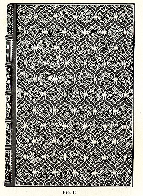
which has since become characteristic of him. In this example, bound for the Duchess of Orleans, the center quarterfoils were red on a ground of deep olive green and the rest of the binding was a brown leather sharply outlined in bright gold.
The Deromes.
Contemporary with the bindings of Padloup were those of the Deromes (a number of brothers, the most prominent of whom was known as the younger Derome).
The characteristic binding of Derome is entirely different from that of Padloup, and as all the mosaics of this period were attributed to Padloup, Derome gets credit for all bindings wherein a tool is used representing a bird with outstretched wings, thus giving a lightness and vivacity to the design. Derome’s covers usually consisted of a lacelike foliated border suggestive of wrought-iron work, as in Fig. 16, from which he undoubtedly borrowed ideas, as the 17th century smithery work had reached a high scale in art
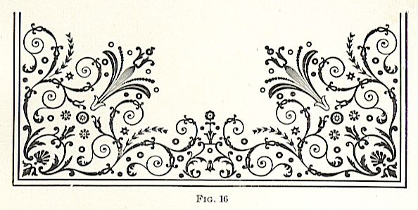
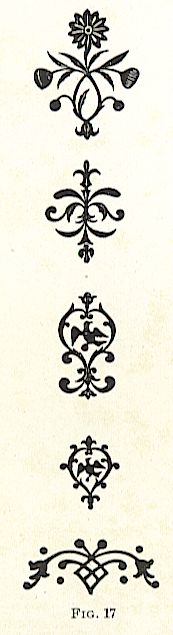
in France. These openwork borders were heavily tooled, and the motives borrowed from the ironwork of the period were capable of immense variation, so that of Derome’s bindings it is not likely that there are two exactly alike. The tools used by Derome are shown in Fig. 17.
18th Century Bookbinding.
In the 18th century, the designs became heavy. Padeloup and Derome had no successors of importance, and the few new tools possessed nothing of importance or interest; they serve only as a key to the period of certain bindings, if the student chooses to so use them at the present day. The development of the book-cover from its earliest condition to its present form should be thoroughly understood if one desires to design book?covers intelligently in the present period.
Knowledge of Styles Necessary to the Designer.
In bookbinding, as in everything else, one style was evolved from another. The Aldine press in Italy, being the pioneer printer of ornament, produced the style that was taken by Grolier to France and developed there into a French style. Then followed the powdered styles and the brilliant fancies of Le Gascon, which in turn gave place to the mosaics of Padloup and the vigorous borders of Derome. Throughout all, the key to the period of each binding is the style of the tool used; and a knowledge of the characteristics of these tools, whether used in the present day for an imitation of antique bindings or for the study of antique bindings to locate their periods, is essentially important.
Comparison of Bindings of Different Countries.
The art of book-binding was developed to a higher point of excellence in France than in any other country. True, it originated in Italy, but Italy was soon outstripped by France in style and ingenuity, while Germany attempted to do no more than paste an ornamental book plate inside of a volume, acknowledging thus her lack of skill to adorn the volume externally. To Germany, therefore, we owe the invention of the book plate. Only one great binder appeared in England during this period and even he cannot be compared with his contemporaries in France .