A book plate is a little device or label executed for the individual owning the books in which it is pasted as an indication of such ownership. The design for a book plate is usually personal in character and is especially suited to the person for whom it is executed.
The bookplate idea is an old custom, but such a one that with the increasing publication of books during the present century it has become very popular. Its origin is somewhat uncertain, but, as suggested here in before, it was probably due to the practice of royal personages who stamped a coat of arms on everything they possessed and thus gave a distinctive character to their particular libraries. In foreign countries, a coat of arms usually forms a part of the device, and the
bookplate design is frequently transmitted from generation to generation, thus playing a part in family history. In Italy and France, where books were bound in a most costly manner, it was customary to stamp this coat of arms on the outside cover, but in Germany, where the binding was simpler and more substantial, there were no outside marks of distinction and the label was placed within the cover, and so in the early part of the 15th century we find that book plates had their origin, and it is not unlikely that the first designer of book plates was Albert Durer. A more modern reason for the existence of a particular class of book plates is found in their use as a suggestive hint to borrowers that the ,book belongs to the individual named.
It is an interesting fact concerning these early book plates that some of them took on a most serious character, while others took suggestive designs or quotations in a lighter vein. The first mission of the book plate is clearly to express ownership, and therefore the modern design should be sufficiently characteristic to remind one at once to whom the book belongs.
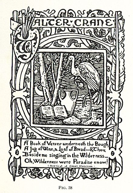
Much criticism has been expressed against the custom of introducing the owner’s name in a rebus or sort of puzzle, as in Fig. 38, or of expressing it in a foreign language, or of making quotations relative to the owner’s library that are unintelligible to English-speaking persons. This, however, is largely a matter of taste. One’s book plate is his own property and may be designed to suit the individual; so long as the design is appropriate it matters not what may be its historic style or language. Hovvever, where a book plate is simple in character and contains no characteristic feature to make it distinctive, the owner’s name should be conspicuous and plain. After this consideration comes the question of beauty or interest, which is of equal importance both to the owner and the designer.
General Types of Book Plates.
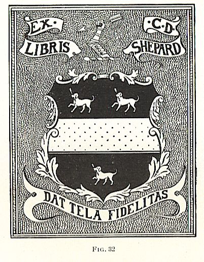
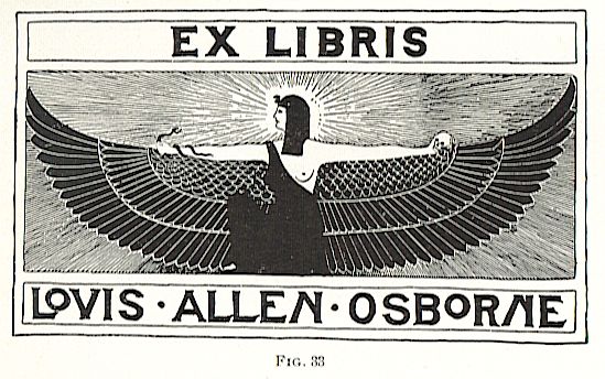
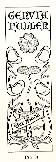
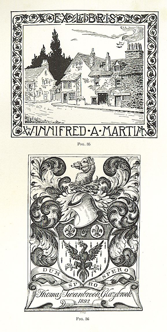
Generally speaking, designs can be divided into four general types: the heraldic, as in Fig. 32, consisting of crests, designs in armor, and traditional family devices; the allegorical, which represents conventionally some symbol or device associated aith the individual or his library, Fig. 33; the conventional, which introduces a purely decorative idea whose sole purpose is to render the design unique and beautiful, Fig. 34; and the pictorial, Fig. 35, which includes designs representing definite ideas associated with the owner or his library, comic situations, or crude representations. The propriety of each class of design to the individual must be judged by the designer, unless direct instructions for the character of the design are given by the owner, and one must bear in mind that these devices, being strictly personal, must be thoroughly appropriate to the books for which they are designed.
The character of these books is not limited to their literary standpoint, as the same books in the libraries of different individuals will assume, from the book-plate standpoint, an entirely different character. A rare book of religious character will naturally possess a different character in the library of the religious person than it would in the library of the book collector who made a specialty of collecting rare volumes; to one it is a book of solemn and sacred importance, to the other it is a curiosity forming a part of a collection of curios, and in designing a book plate for either person due consideration would have to be given to the individual rather than to the library.
Book-plate designs may vary extremely in character according to the books in which they are placed and the persons to whom they belong. In foreign countries where family crests, coats of anns, and other insignia are consid?ered of importance, it is frequently customary to embody these in a design.
Other book collectors seem to prefer a simple device based on some personal characteristic, and occasionally a simple illustration based on some grotesque idea. A few illustrations of these will serve better to indicate the variety of ideas that contribute to these marks of possession.
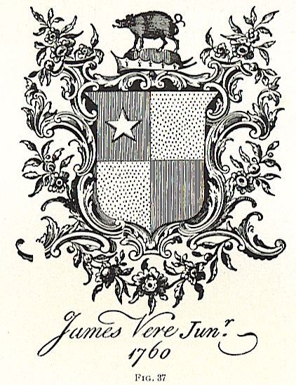
In Fig. 36 is shown a reproduction of an engraved book plate based on a heraldic design of the 16th century, while in Fig. 37 is an 18th century design showing the influence of the rococo style of ornament for the decoration of this period. A more modern English plate is that of Walter Crane, designed by himself, which consists of a pun on his name, shown in Fig. 38,
while that of Alma Tadema, the artist, represents an easel in the form of his initials, Fig. 39.
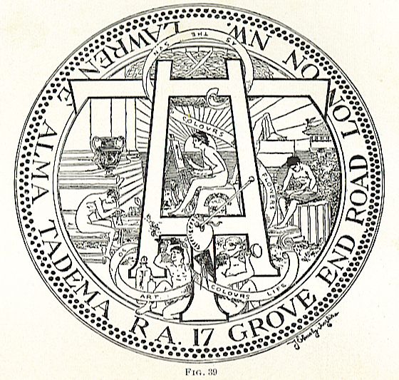
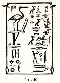
Fig. 40 was designed for Rider Haggard, the author, and consists of Egyptian hieroglyphs descriptive of his works.
In Fig. 35 is shown a book plate, the characteristic feature of which is a detail taken from one of Scott’s novels, the scene being associated with Kenilworth. In Fig. 33 is a form of design based on an Egyptian idea and represents an Egyptian Diety holding separate Superstition and Wisdom, while Fig. 34 is a simple floral design intended purely for ornamental purposes and suggesting no allegorical idea whatsoever.
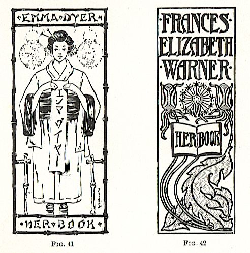
The book plate shown in Fig. 41 was designed for a lady about to take up her residence in Japan, and was intended for a label for only such books as she might take with her or bring back, the association being entirely with this event. Fig. 34 shows a design based on a conventionalized floral form borrowed from Fig. 10, Plant Analysis. Fig. 42 shows an adaptation of the conventionalized dandelion arranged to fill the space and render ornamental what would otherwise be a simple label. These designs are introduced here to show the application of ideas derived from natural forms to simple design purposes. Thus it will be seen that, while the book plate is personal in character, it does not necessarily partake of any distinct individuality that applies exclusively to one individual.
While a similarity of book plates may be accidental, it does not necessarily follow that one is more unsuitable to its purpose than another, simply because in the mind of the observer its direct relation to the owner cannot be determined. In the majority of cases, the owner himself is the best judge of the suitability of the book plate, and while the artist may find it necessary to submit a number of sketches in order to get the owner’s ideas, the latter is always to be the judge of what is to be preferred.
STYLE OF RENDERING
Like every other class of design, book plates should be rendered in the medium and method best suited to each individual case. The majority of them are probably etchings on zinc from pen-and-ink drawings printed in plain black on a white label. Exceptions to this rule may arise by the introduction of two or more colors (as was the case in Figs. 34 and 42 where the conventional leaf forms were printed in green), and in certain individual instances ~where a three-color half tone might be used, or even the lithograph, to represent the design in many colors. The method of drawing for zinc work is precisely the same as that for general illustrating or for paper bookcovers. Certain conditions may demand that the design should be conventionally rendered, but no attempt at pictorial detail or local shading, similar to Figs. 21 and 35, should be made, but a pictorial rendering like that shown in Fig. 22 is perfectly proper when circumstances demand it.
Simplicity should always be borne in mind as the most desirable characteristic in the rendering, and the simplest method of rendering a chosen design is always the best. Designs that are to be reproduced in half tone should, in nearly all cases, be severely conventional, as the soft effects obtained by this method of reproduction are likely to render a pictorial effect so soft that it is not well suited to so utilitarian a purpose as a label.
LETTERING
In all classes of bookcover, book-plate, and poster designs too much care cannot be given to the subject of lettering. A mistaken idea prevails in the minds of many artists that so long as the general design is well conceived and executed, the lettering is of secondary importance, and other still less experienced people incline to the belief that better lettering can be supplied by the printer than can be drawn by the artist. All this is decidedly wrong; in many respects the lettering is the most important part of the design-at least if it is so considered there will be little danger of the artist falling short in this particular. It should be borne in mind that the essential feature in the book?cover, book plate, or poster is usually the purpose for which it is made and the subject that it represents, and this is expressed in the printed matter impressed on it. This, if for no other reason, should settle the question of the inadvis?ability of careless lettering. The arranging, proportioning, and spacing of letters in a design should be as much the subject of study as the distribution of any other ornament, and after it is generally sketched in it should be carefully outlined and worked up to the last detail.
Letters that appear in the finished print to be carelessly or sketchily rendered are usually the result of greater care than those that are exact and uniform. Original ideas in letter forms require particular attention in order that their parts may be balanced well, and in many cases it is far better to exaggerate the characteristics of a letter in the direction that it ought to go than it is to fall short in the slightest degree in the proper proportioning. Take ordinary printed letters, for example such letters as B, E, and S in the capitals, and while they appear to be exactly uniform at top and bottom, it may be easily discerned by turning the print upside down that the lower portion of the letter is considerably larger than the top, and by an experiment in drawing one readily learns that to proportion one of these letters exactly symmetrical so as to make its top and bottom equal in size gives it a top-heavy appearance that is very unsatisfactory. This defect is not so prominent in the lower-case letters, but a common error here is to make the stroke of the d and t quite as high as those of the other long letters, thereby throwing them out of proportion.
It is well, however, in all cases not to make the lower-case letters perfectly circular or elliptical, but rather to give the round ones an oval shape with the larger portion at the bottom. In lower-case letters like the French Roman and the Medieval Roman alphabets this peculiarity is very marked. The lower portion of the c, e, d, etc. is considerably wider than the upper portion, and in the letter s this particular is strongly emphasized. It is found desirable in many cases to give a careless or artistic effect to the rendering of the letter so as to detract from it the appearance of having been rendered mechanically. The novice is inclined to the belief that this appearance is given to it by actual carelessness in the drawing, whereas, as a matter of fact, more skill is required in the rendering of this style of letter than of one that is perfectly clean cut in its outline. For bookcover work it is better that all rendering should be freehand, including both the lettering and the ornament, except in such instances where a decidedly stiff and mechanical appearance is intended, and to render this effect most forcibly each letter should be carefully outlined with a pen and the solid portions filled in with a coarser pen or a fine brush. This method of outlining serves the double purpose of producing a clean even edge to the finished letter and of enabling the designer to preserve a uniformity of width in the stems and strokes that can be better judged when these details are in outline than when they are drawn solid.
While the designer may exercise the greatest liberty in the choice, style, and formation of letters, in order to design original lettering he should study the characteristics of the simple alphabets. A thorough knowledge of the proportions of the light antique Egyptian and the Medieval and light French Roman should enable him to design other letters in accordance with the proper proportions without in any way indicating that he copied some certain style. 62. A standard style may be varied somewhat without in any way destroying its individuality. For instance, the light antique Egyptian may be extended or contracted so that the same height of letter may fill a longer or shorter space. This will change the slant of the sides of the A, W, and V, but in the letters H and M the extension may be effected by inclining the sides somewhat, thereby preventing a squatty appearance to the letter.
In the letter N, the left stroke only should be inclined in order to preserve the appearance of stability. The details of this alphabet may also be some?what exaggerated; the horizontal strokes of the A, E, F, and H may be raised or lowered considerably where it is desired to severely conventionalize the letter, and the upper loop of the B, P, and R may be materially diminished in height. The same liberties may be taken with the light French Roman but with less freedom, ,vhile the Medieval Roman is best kept in its standard form without alteration.
The Gothic alphabet offers the greatest opportunities for variation of any, while at the same time it is one of the most severely conventional. The left stroke of the A, terminating as it does in a large disk, may be carried still lower and under the right stroke with perfect propriety. In a similar manner, the curved stroke of the H may be swept under the vertical stroke, and the J may be constructed with a vertical stem similar to the I. The W is often designed as an inverted M, and the U as a symmetrical letter, both of its sides similar to the curved stroke in the W. The T is frequently drawn with a vertical stroke and horizontal crosspiece similar to the upper part of the letter F, while the Y may partake of the same characteristics as the U and V when it occurs in the same lettering.
Whatever is done in the way of lettering should be done with the greatest accuracy and care, as no design, no matter how well executed, can be accepted by a careful purchaser if the lettering is not as carefully thought out as the rest of the motive.